Bowlero is the largest ten-pin bowling center operator in the world and In 2019 I worked with them to redesign elements of their existing site. After that Initial engagement ended, the Bowlero team came to us with another project; Create an improved mobile-first experience for Bowlero customers to easily and quickly reserve lanes for open play.
Bowlero's existing online booking flow was a long, ten-step process that catered to large scale corporate events and parties. Bowlero wanted us to create a new online booking experience that would allow smaller, casual groups to book bowling experiences online quickly and simply.
We were informed that we would have to design with the limits of Bowlero's current back-end booking system. This would be a major contraint that we would have to work with, dictating the types of data we could call to certain pages and limiting the edit-ability of saved user inputs. However, we were sure we could still design an improved and streamlined booking flow despite these limitations.
During the project, I worked as the primary UX designer, alongisde a visual designer and under the guidance of our UX director.
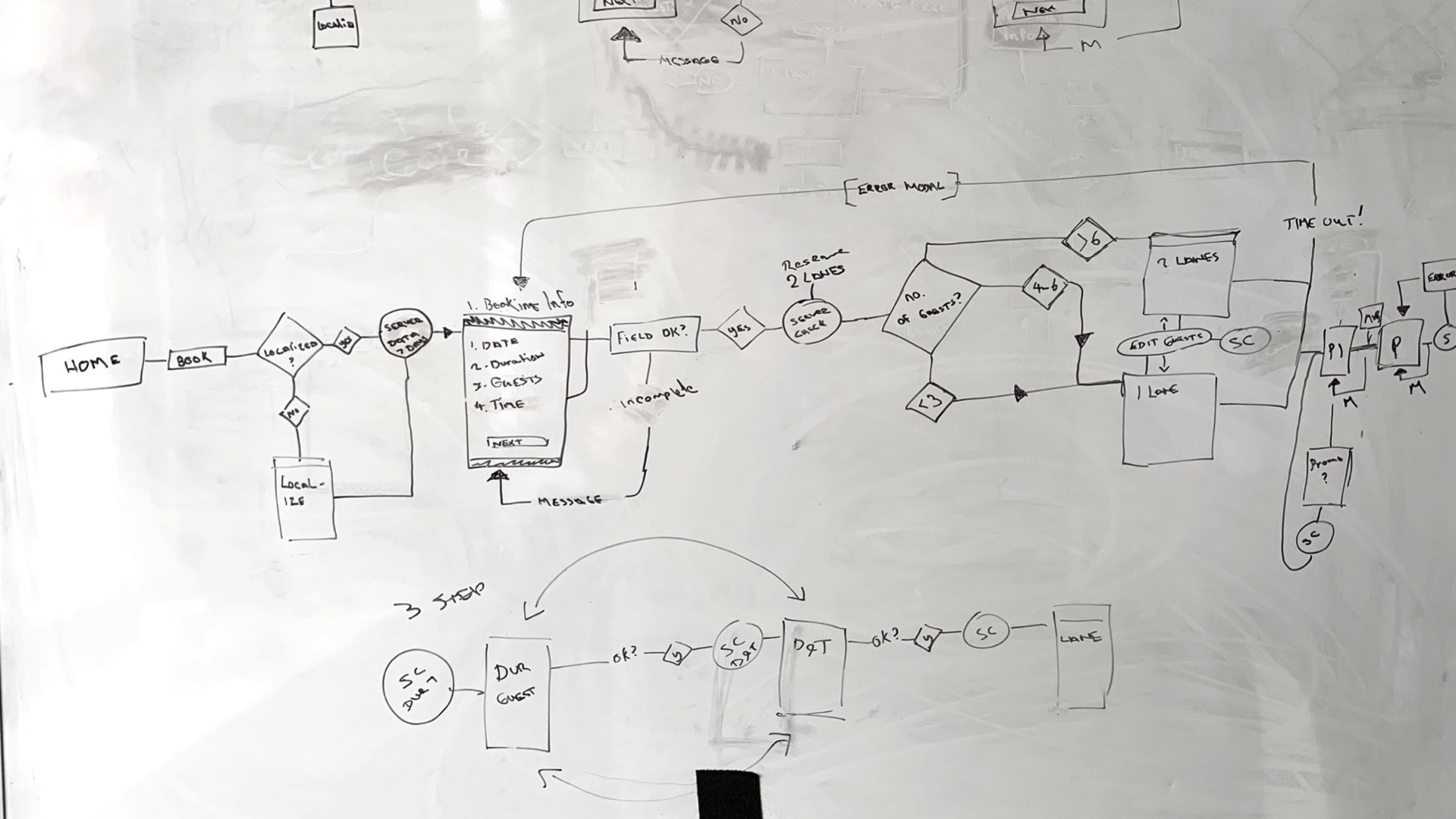
At the beginning of the project, I spent time reviewing Bowlero's existing booking flow. It was a long 5-step process, with each page only displaying a single input. Users did not have much visibility into the impact of there choices, for example how selecting 3 people on step 1 would affect lane availability and times in step 3 and 4. The experience was sluggish and static.
I mapped out the booking flow in a flow diagram, noting each step, the inputs and where the system would make calls to the server to send and recieve data. I called the existing bowlero flow the 'Old Skool' flow.
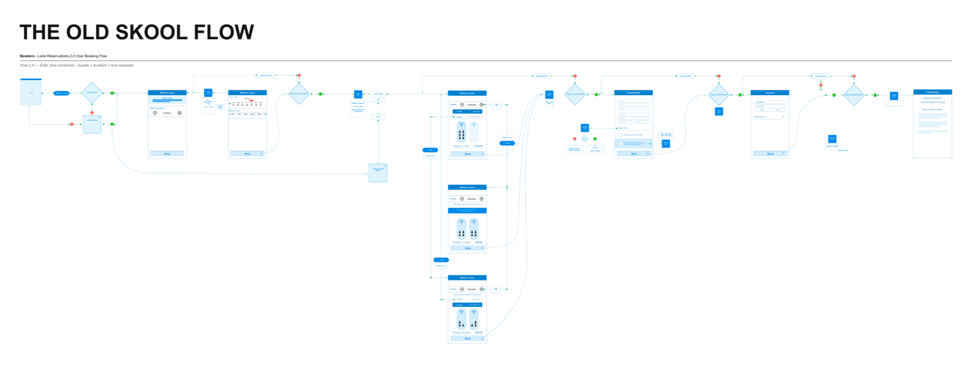
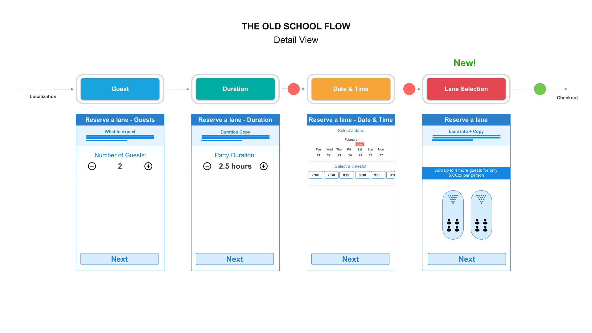
The Old Skool flow diagram
At the beginning of this project, I wasn't too concerned with the overall UI yet, I wanted to understand the high level overall flow of the experience first. What inputs do we need? What order should the inputs be in? How many steps will this flow be?
The client wanted us to move fast, but I wanted to get more insight and user feedback on potential booking flows. I conducted a quick and scrappy card sorting exercise with people in my office and staff and customers in the Times Square Bowlero center. I mapped out the 5 main booking inputs; Lanes, No. of Guests, Time, Duration & Date to cards and asked people to sort them in the order that they would want to book an event.
I found the vast majority of users wanted to select date and time first, followed by duration, number of guests and then lanes. Talking with people ,I also found that they would hop back and forth between different dates and times, as they explored availability, often while messaging their friends. It was extremely helpful to talk with real people about how they book events before we got into any major ideation of design.
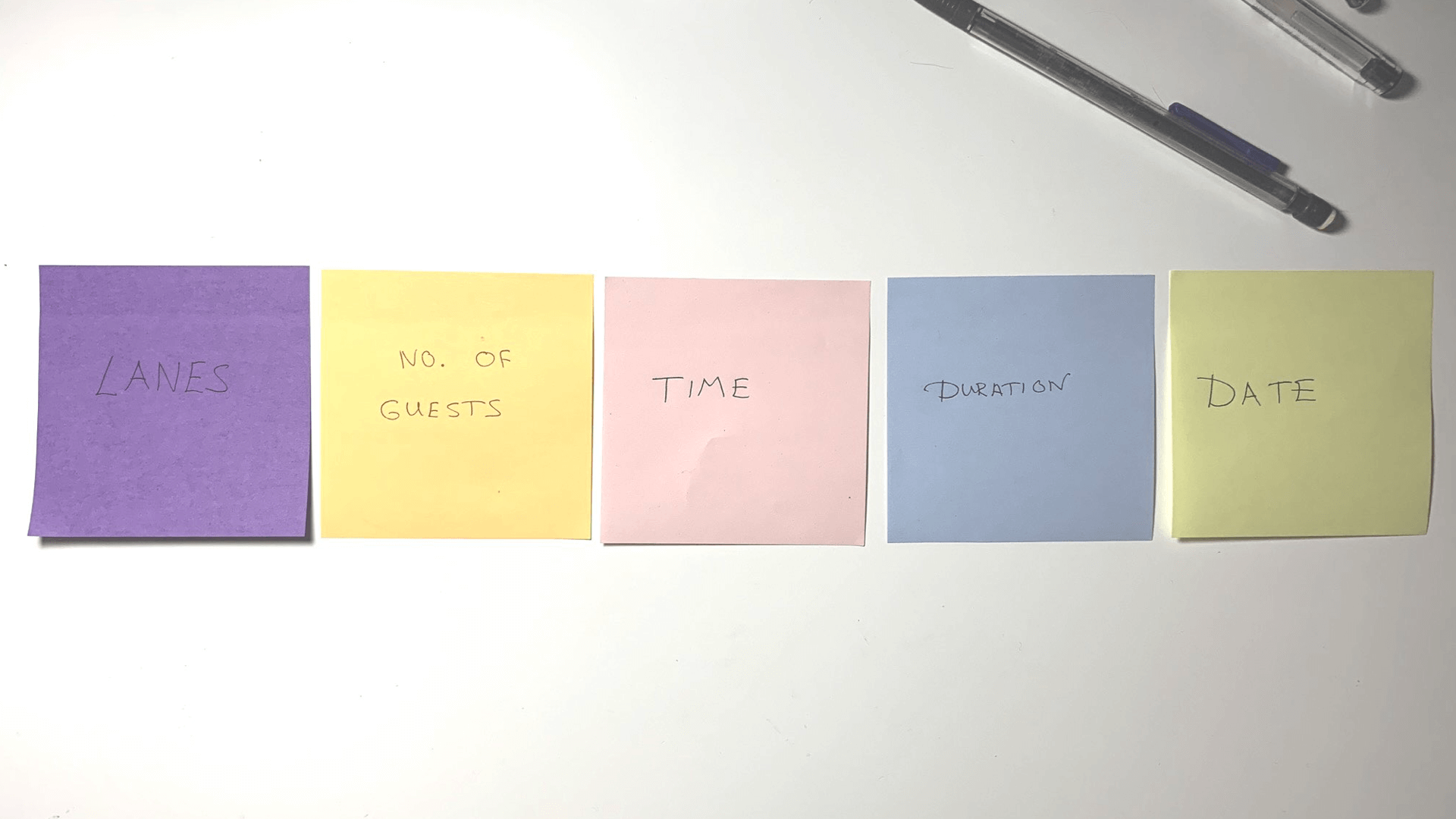
A simple, scrappy card sorting exercise was extremely helpful gathering data early on in the project.
With some small amount of research and insight collected from the card sorting exercise, I began to ideate and sketch out some new improved booking flows. I wanted to explore a number of different flows to see how the existing booking flow could be improved but also to present the client with a number of options. I was aware that the client's older backend system might struggle if the flow was too dynamic, so I wanted to ideate a safer more 'traditional' booking flow as well as a more progressive and dynamic flow
I sketched a number of flows out on the whiteboard and discussed them with my UX director and visual designer. Incorporating their feedback I formalized the sketches into flow diagrams. In my early flows, I explored combining inputs into a smaller number of pages. Instead of having 5 inputs spread across 5 pages, could we place 'Time & Date' or 'Time, Date & Duration' together on one page. Then could we place number of guests and lane selection together on the next page. This could give the user more insight into their selection and make the booking process shorter and more dynamic. For example; a user could select 'Thursday' and then immediately see the times available for that day without having to load a new page.
Some early flow sketches and flow diagrams.
I continued ideating on the idea of combining the booking inputs into a smaller of set of pages until I reached the natural conclusion, what if we place all the inputs on one page? Having everything on one page would allow users to have a bird's eye view of the available options and allow users to select options dynaically. I knew from my early research that users would often move back and forth between different dates and times as they solidified plans. A one page experience would provide users that flexibility without constantly navigating back and forth between different pages. This ideation led to a new flow dubbed the 'All-In-One' flow. I thought this flow had a lot of promise, however I had concerns this would be too much for the Bowlero backend system.
I presented a number of flows to the Bowlero team and their development team, contrasting the existing 'Old Skool' flow against a number of improved flows, including the 'All-In-One' flow. The Bowlero team, really liked the idea of the all in one flow and it's potential benefits and after some long discussions with the development team we found a solution that would allow us to implement the new flow with the existing backend system.
Aligning on the 'All-In-One' flow as the preferred way forward and confirming that it could be implemented on the existing system, we then began the design phase.
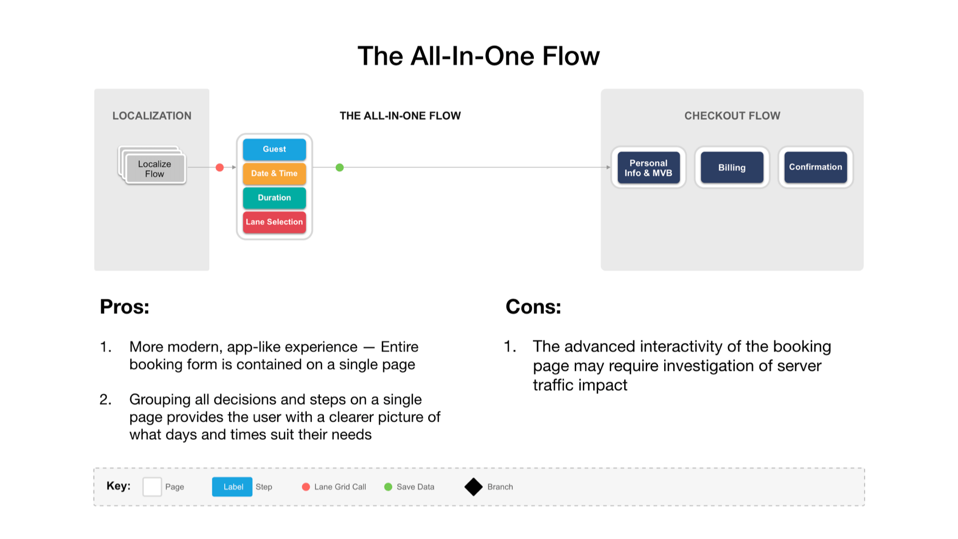
The all in one flow diagram.
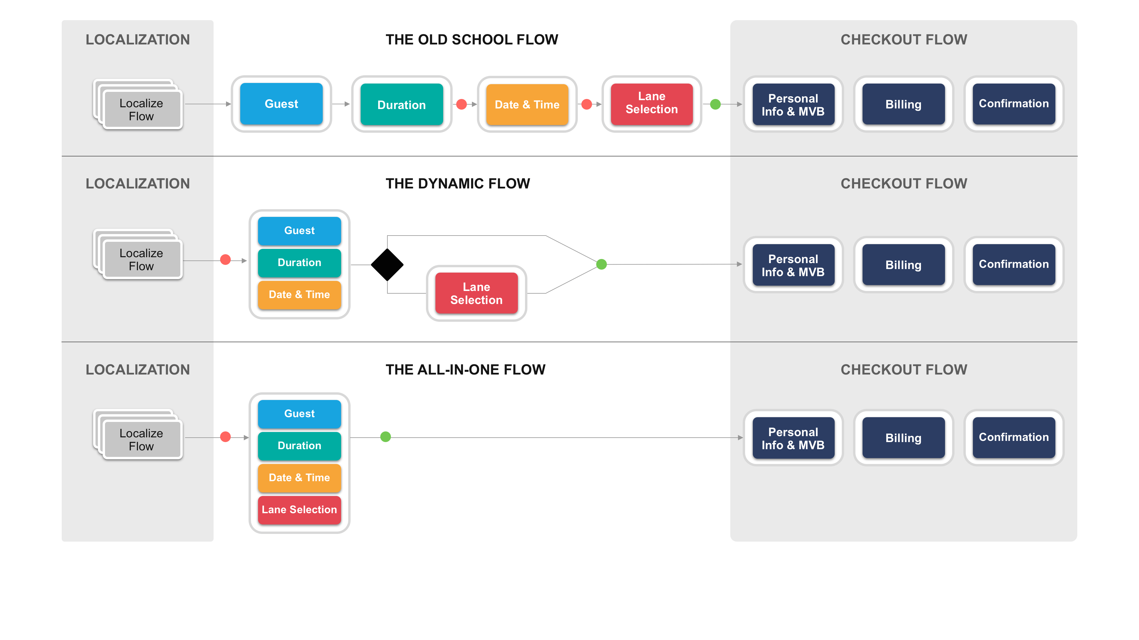
Some of the different flows we presented to the client.
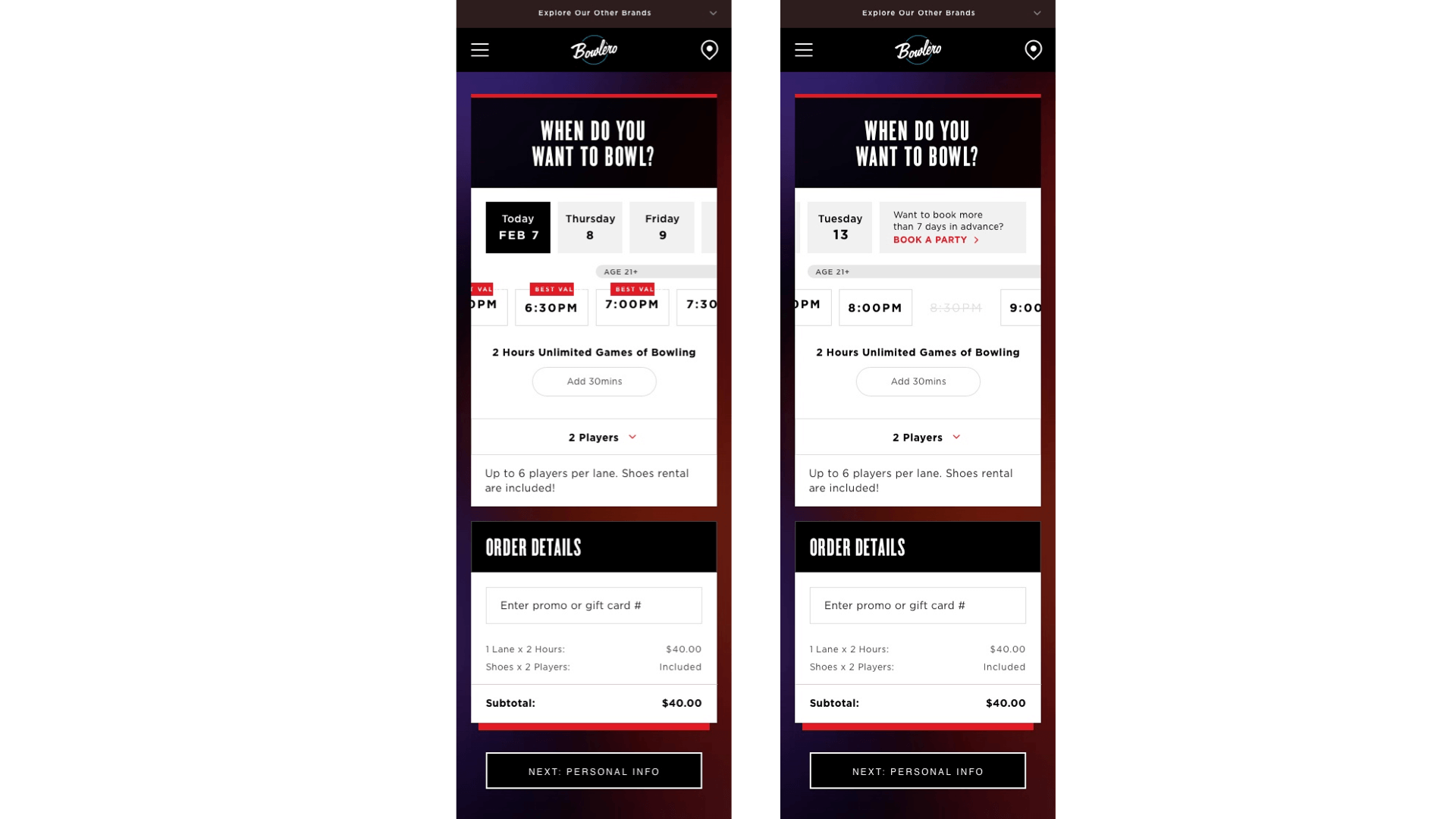
In the early design phase, I began sketching out a number of different UI layouts and affordances. One approach was based around using a swipeable carousel to display date and time selections. Users could easily visualize availability for upcoming days and swipe to explore days later in the month. Combined with the time carousel, users could quickly explore a number of different date and time combinations.
I explored a number of ways to visualize lane selection, including a bowling lane graphic that visualized how the lane setup would look. However, Talking again with customers at Bowlero, I found that many people were confused by the 'lane selection' option in general, often not knowing how many lanes to select per group. After discussions with the Bowlero team we opted to remove this input and combine it with the 'number of guests' input. So your lanes were determined automatically by the system depending on the size of your group. This would reduce confusion and simplify the flow.
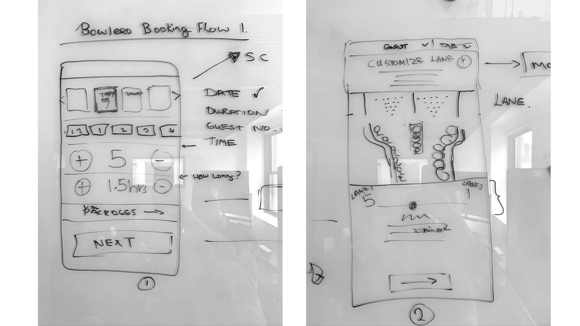
Early UI whiteboard sketches.
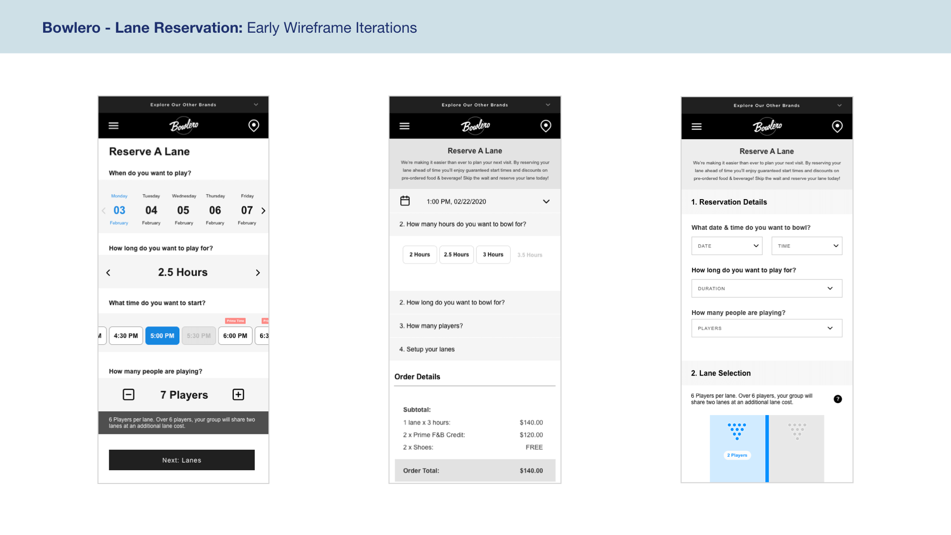
Some early wireframes exploring different concepts such as a dynamic app-like UI, a collapsing style UI and a simple dropdown approach.
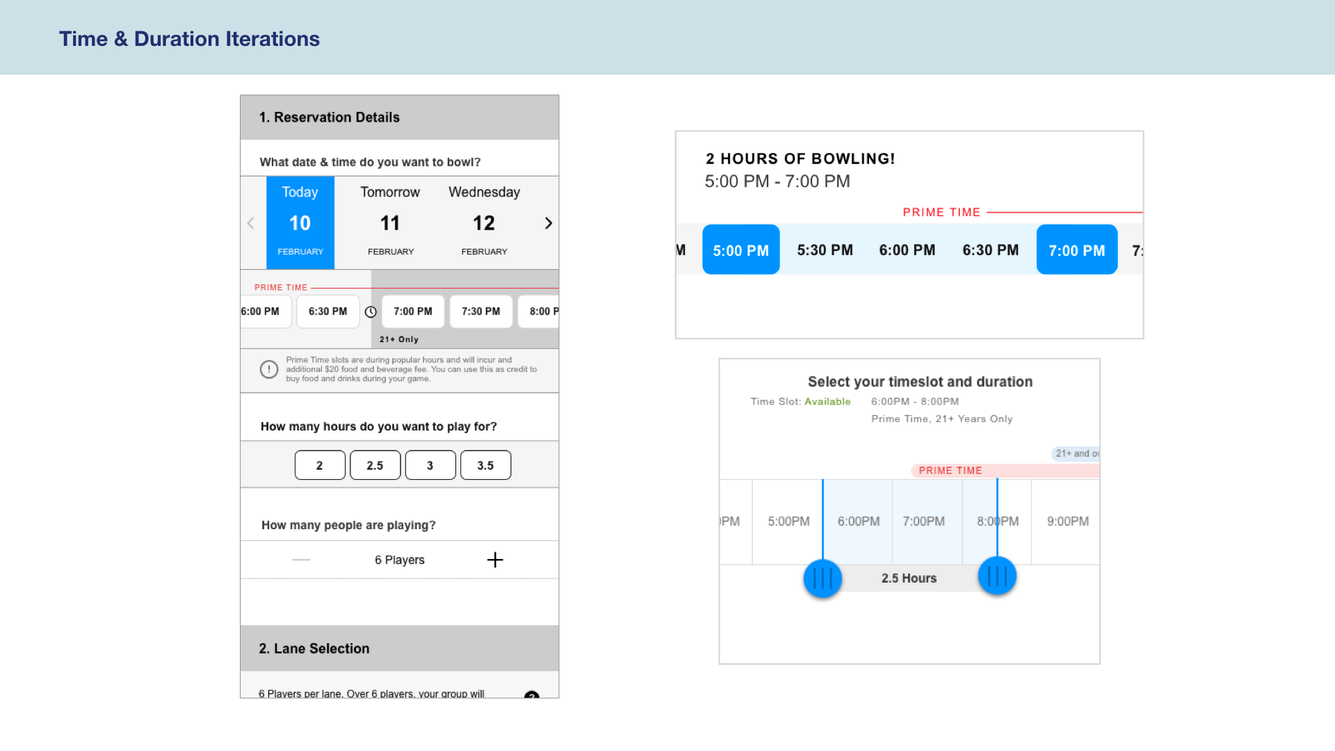
Some early explorations of the time, date and duration selectors.
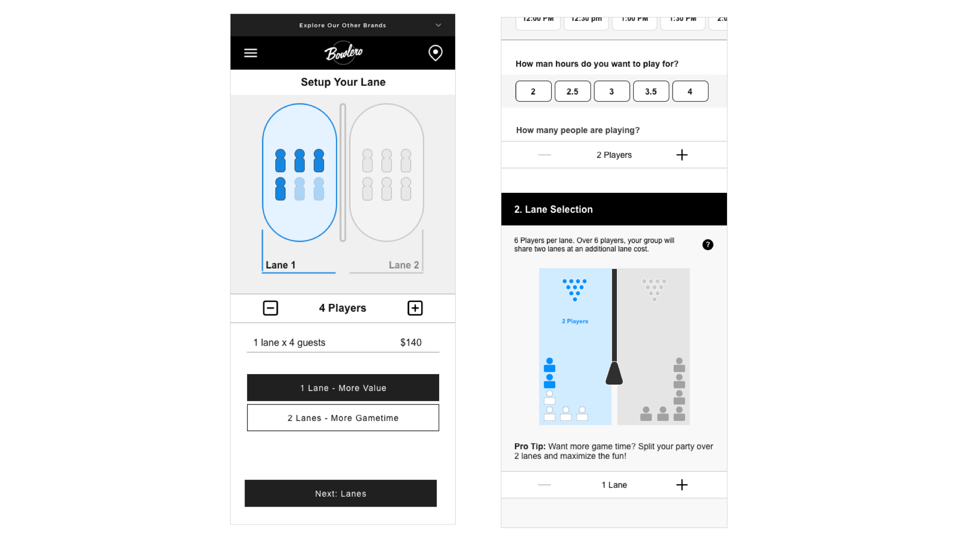
Early iterations of the lane selection feature.
In a lot of my early sketches and wireframes, I explored very dynamic, app-like inputs. I wanted to really utilize mobile elements to create a simple and smooth experience that would gives users a lot of visibility into availability but also elevate the brand look and feel.
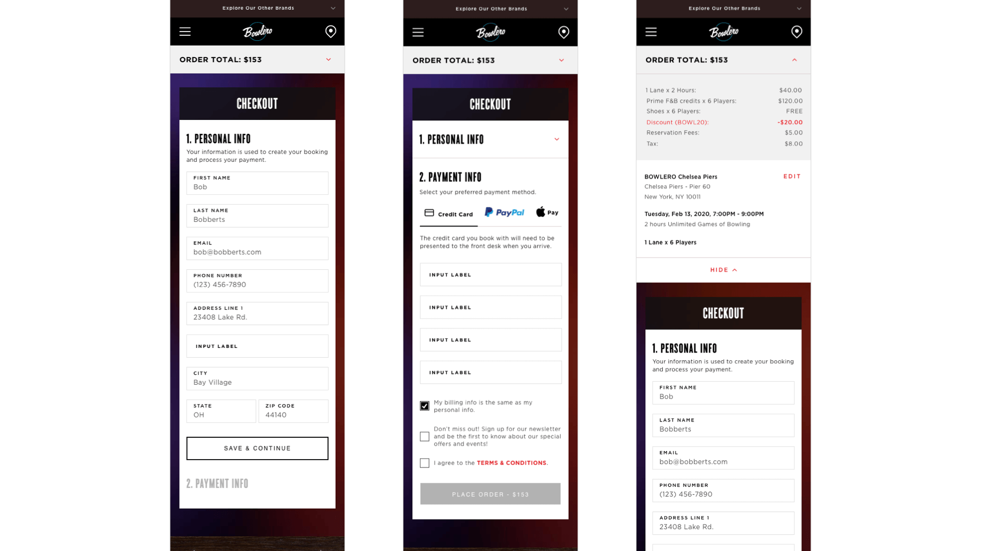
Alongside these dynamic wireframes, I also sketched and designed a set of wireframes dubbed 'The Basic Model'. These utilized simple dropdown inputs and native mobile pickers to allow users to make booking selections. This alternative set of wireframes didn't have the same 'visibility of availability' that the dynamic wireframes provided to the user, however they were still very simple and also much easier and faster for the development team to implement.
After Iterating through both sets of wireframes a number of times, I presented both the dynamic wireframes and the basic wireframes to the Bowlero team. I got a lot of positive feedback on both options and there was a lot of discussion around the pro's and con's of each. The dynamic wireframes were modern looking and allowed users to quickly explore availability simply and dynamically, while the basic wireframes were simple to implement and also a familiar pattern for users to engage with. Using simple dropdown inputs, there was a possibility that the basic wires, might be faster for users to book with and faster to implement. Based on this we decided to test both versions of the wireframes with users and pit them head-to-head.
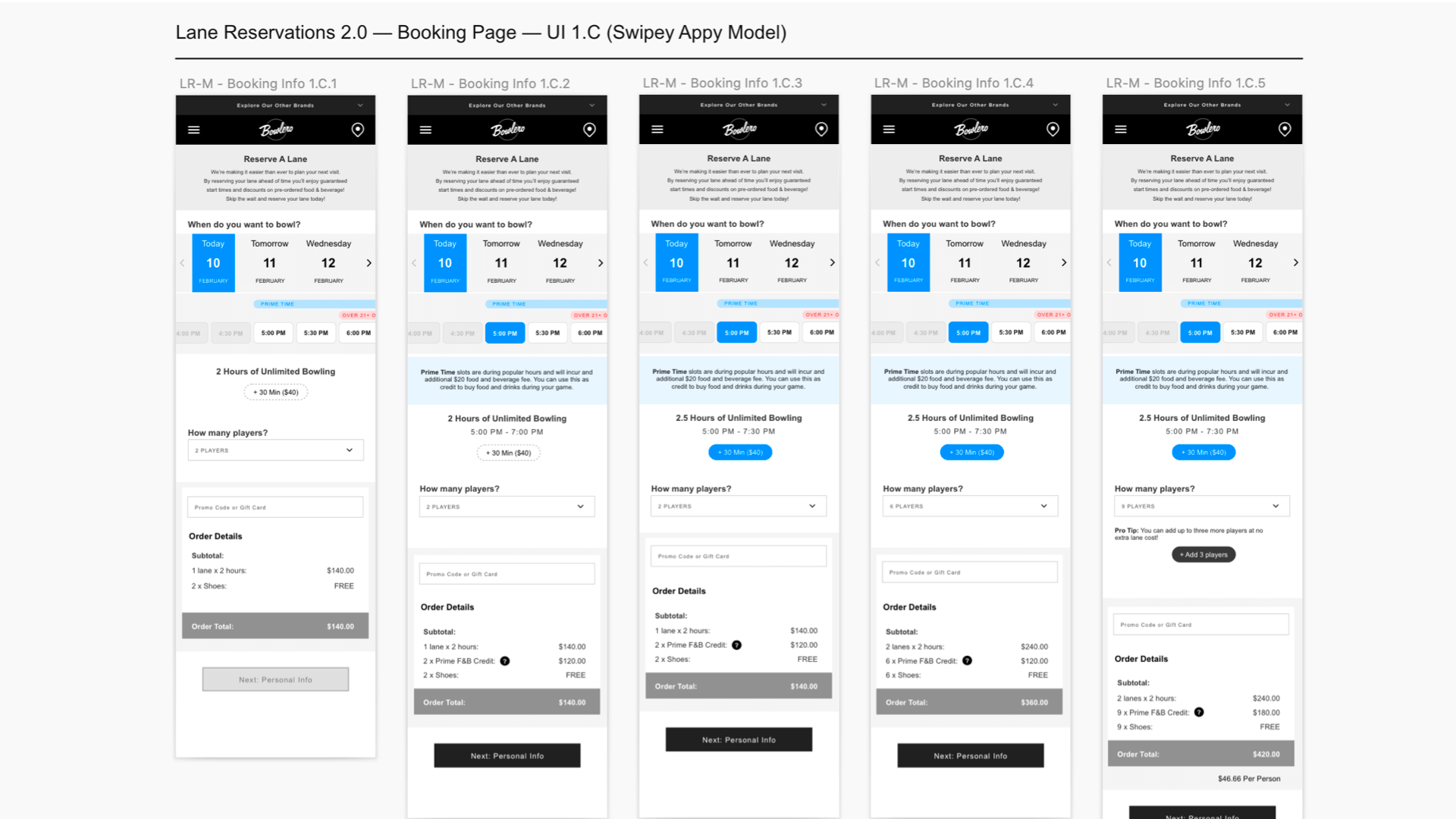
Some of the dynamic wireframe designs.
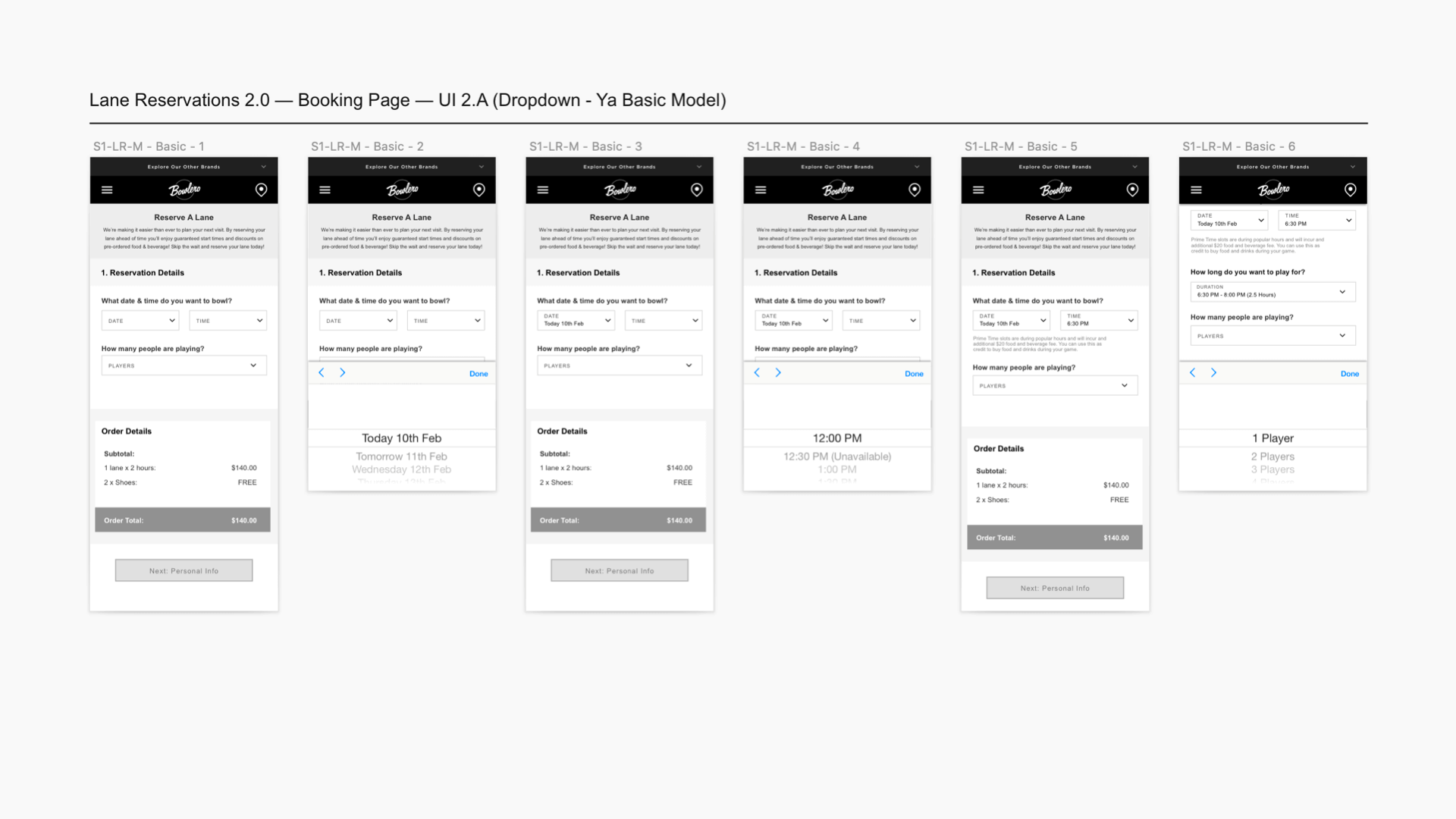
Some of the basic wireframe designs.
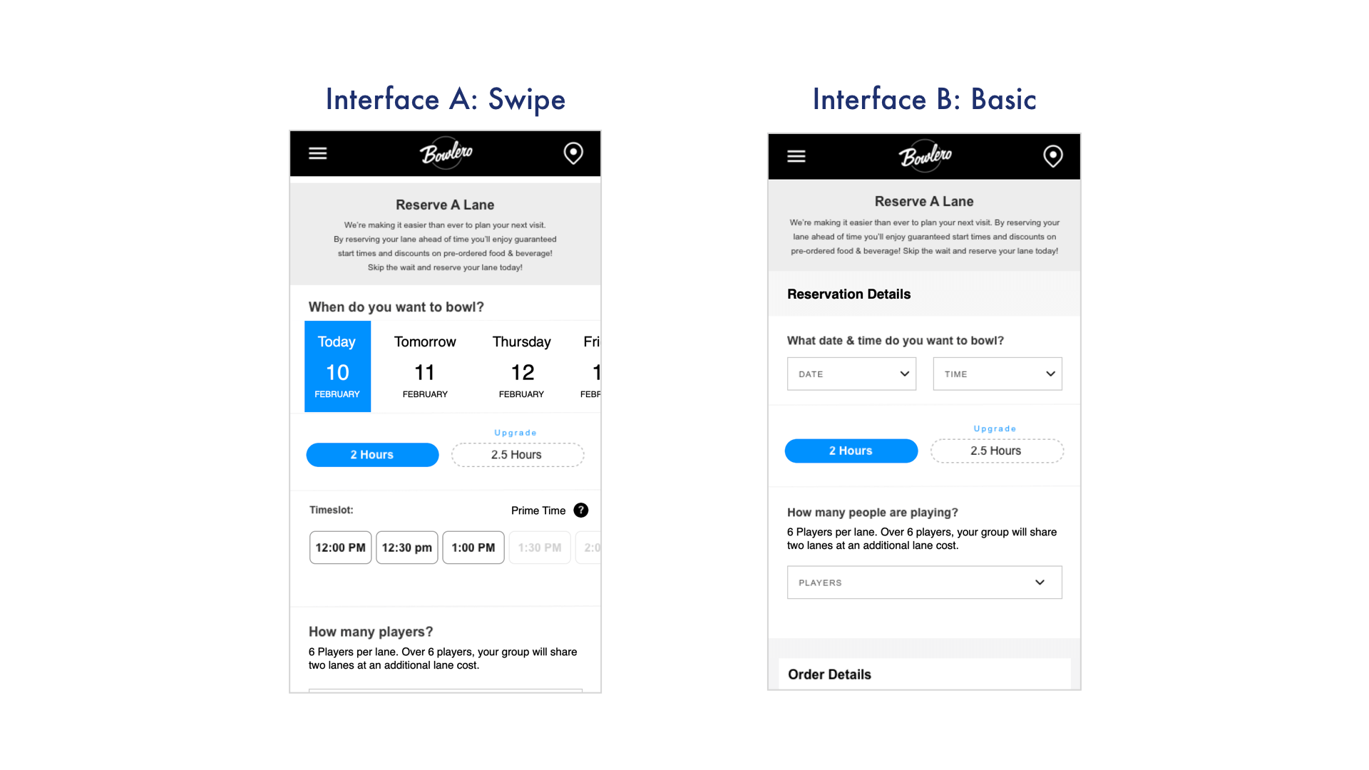
A quick comparison between the dynamic and basic wireframes.
I prototyped up both sets of wireframes in Principle. I created a dynamic and interactive prototype that allowed users to scroll and select a wide variety of different options. I wanted to get as close to a real mobile experience as possible since the test really hinged on the inputs themselves.
Once the prototypes were designed, I developed and wrote a testing document for the test. Each participant would be given one of the prototypes and asked to complete a series of booking tasks, such as booking bowling for 3 people sometime this week. I record the users interactions with the prototype as well as time them on each task. During the test I would ask the particiapnt to talk me through their thought process. Once the participant had completed the tasks, I would ask them to complete similar tasks on the other prototype. To reduce bias, I would alternate which prototype each participant would start with. Finally, at the end of the test, I would ask for the participants thoughts on both prototypes and what they like/disliked about each.
Our team set up a testing area in the Bowlero Time's Square location and tested dozens of real customers as they came through the location. Our in person prototype was incredibly successful and we got lots of great feedback about each prototype and how they fared against each other.
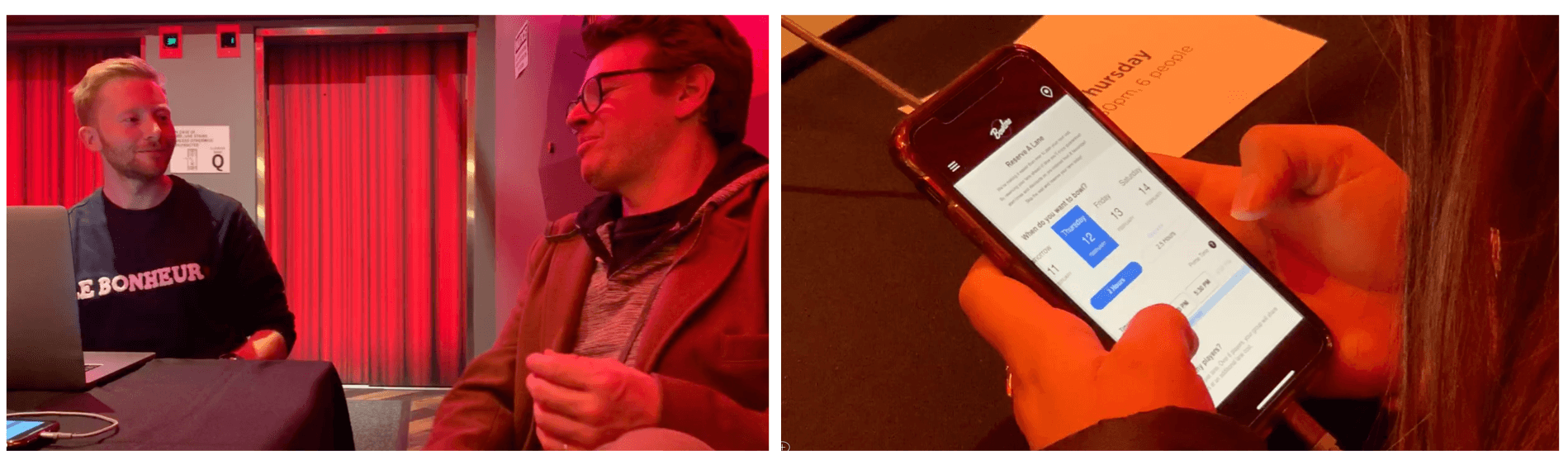
Testing our prototypes with users at Bowlero in Time's Square.
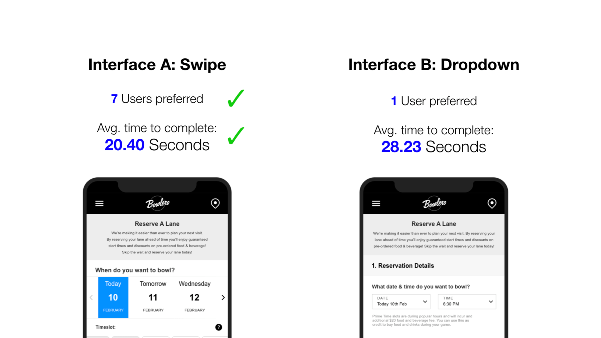
Overall, the vast majority of users preferred the dynamic prototype. They really appreciated being able to visualize the date and time availability while searching for times. Even though the UI pattern wasn't very familar, users were quick to understand the swiping carousel interaction. User's disliked the dropdown pattern as it felt clunky and slow to go back and forth between different options. Finally, on average, users completed the tasks much faster on the dynamic version than the basic version.
Based on our testing results, we opted to go forward with the dynamic version of the UI. It was much more well recieved and performed much better during the tests. I took the user insights we gathered during the test and applied them to wireframes before starting work on the desktop variations.
Testing our prototypes with users at Bowlero in Time's Square.
For this project, we had so far focused on mobile first. This was an approach our team was used to using, but the client was also really keen to work this way, as they wanted the experience to be quick, simple and casual. Something you could book in 5 minutes on the bus. After we had designed our mobile interface and had aligned on a path forward with our testing data. I began to wireframe the desktop variations of the flow.
I kept the desktop approach really simple and upscaled many of the mobile designs. The UI elements translated really well from mobile to desktop and I did not encounter any major design challenges.
Some of the desktop wireframes.
Our team's visual designer took my final wireframes and created the final visual designs for the UI. I provided UX insight and feedback during this process. Once the designs were complete and approved by the Bowlero team, I wrote the final technical annotations for the UI before we handed off the the Bowlero development team to implement.
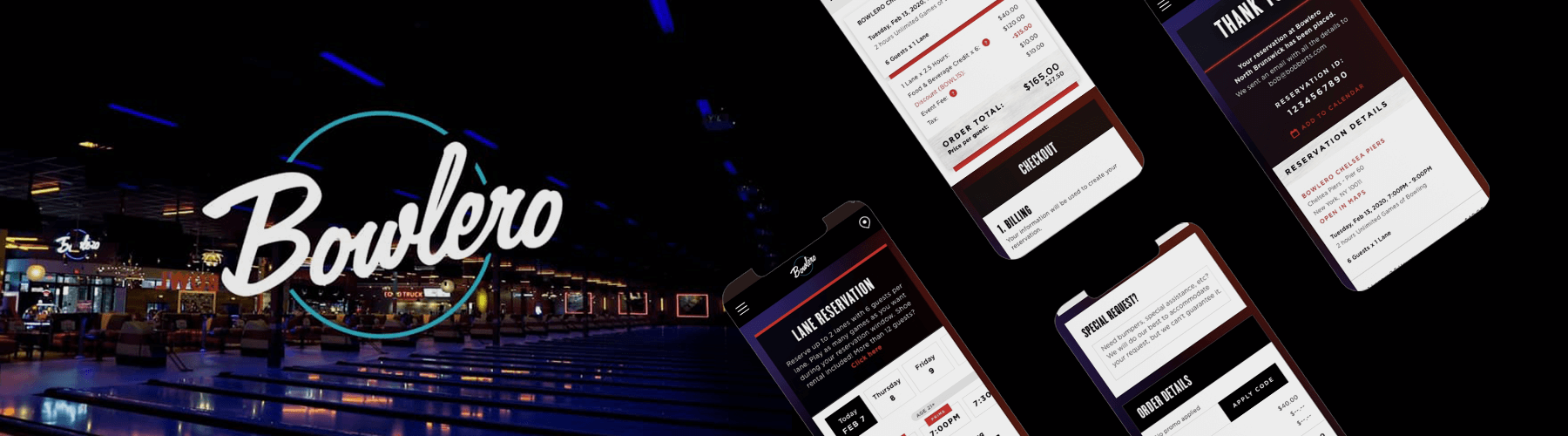
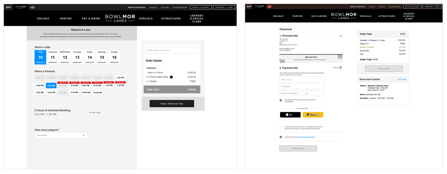
Some of the final visual designs.

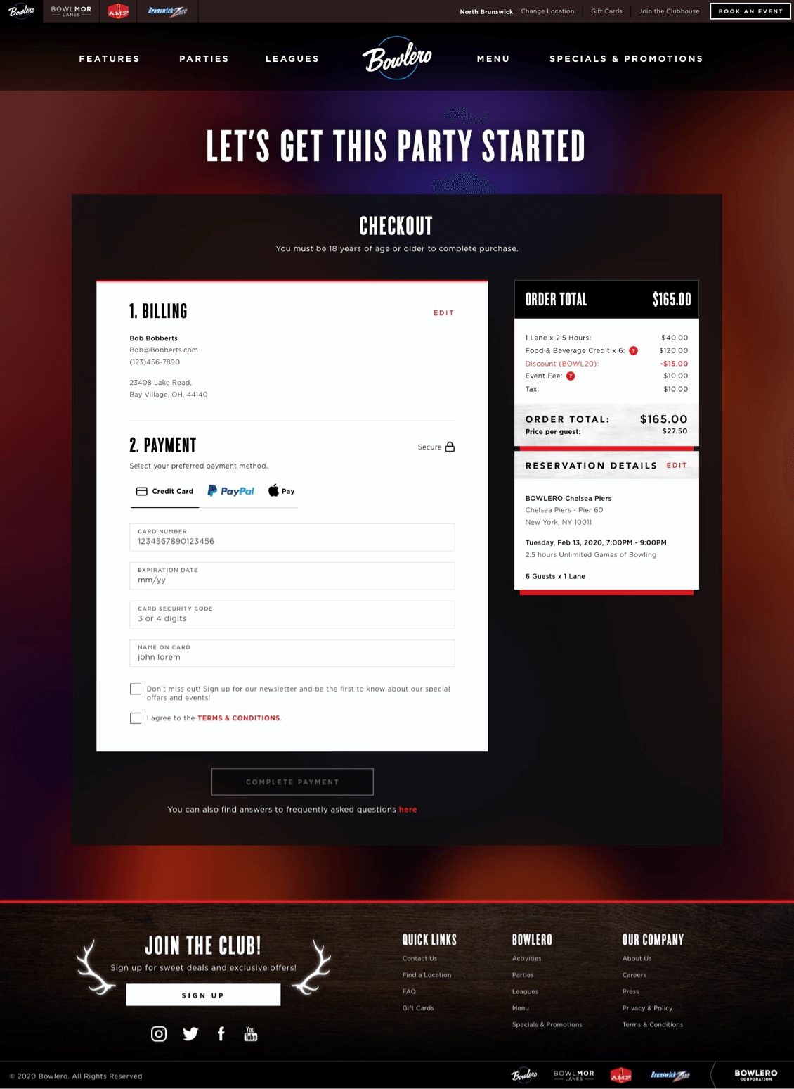
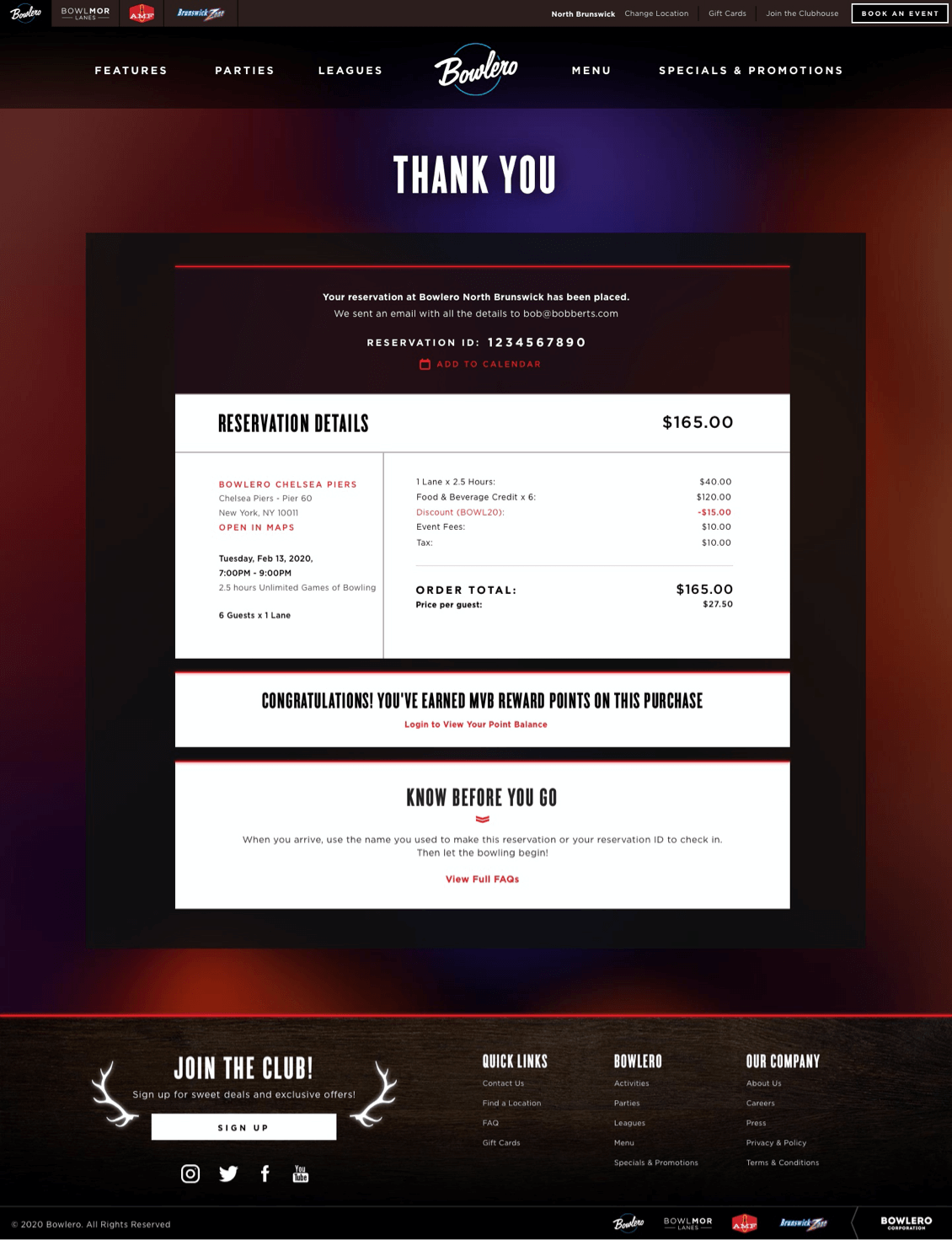
Some of the final desktop visual designs.
Despite the challenges, overall this was a really exciting and fun project. We had a short deadline and a small team but all of us brought our A-game and delivered a hugely improved booking experience that makes the Bowlero booking process so much easier for users. I had never designed a booking flow like this before and I learned an absolute ton talking with users and exploring different design ideas.