Create a captivating new Nespresso homepage experience that mixes brand voice, sustainability content, product highlights and seasonal promotional marketing to serve both new and existing customers alike.
In July 2020, Astound was tasked with redesigning a new homepage for Nespresso. We had worked with Nespresso on a number of smaller engagements and site optimizations and we were excited to get the chance to redesign the primary landing page. Our main challenge was to design a captivating and engaging homepage that served new and existing customers, while working within the limitations of the Page Designer backend framework.
This was quite a short engagement with only a few weeks to delvier final designs, so we didn't have a huge amount of time to conduct any in-depth research. However, we were able to get analytics and research from Nespresso that gave us key insights into problems that we needed to solve.
1. Returning customers found it difficult to discover new coffee flavors that they felt confident in purchasing.
2. Customers didn't realise Nespresso products were environmentally friendly and held a negative view of the brand in regards to sustainability
3. New customers found the current homepage to be archaic and out-dated.
I worked as the lead UX designer on this project alongside another UX designer and a Sr. Visual Designer. This project won the W3 Gold Award for best homepage in 2021.
During our initial sketching sessions, we created zone diagrams of the homepage. These helped us map out the flow of different modules down the page as well as the layout of the page content. We decided to break the page content into three main buckets, 'Promo' moudles for new releases or offers, 'Product' modules for guiding users to product categories, and 'Content' modules to highlight brand values and initiatives.
Side-by-side breakdown of content types on the original Nespresso homepage.
We workshopped the zone diagrams with the Nespresso team to get their perspectives on the content layouts. Our thinking was to display a mix of content types above the fold highlighting promotions, products and brand content. Below that display evergreen product pathways into the two primary product categories. Finally we would display a mix of promotional modules and brand content modules.
It was during this phase that we decided the split the homepage into two separate experiences. One for new and logged out customers that focused more on brand and product discovery and another for returning logged in customers with a focus on promo content and coffee discovery
Zone diagrams and content breakdown.
After aligning on the general page and content layout we started to evolve our sketches and zone diagrams into higher fidelity wireframes. We had be mindful to work within the restrictions of the 'page designer' system that Nespresso was using to implement their site. Each module had to be relativly simple in design, utilizing just imagery, text and CTA's.
On the logged out homepage we added a new customer sign up promotion banner and large product pathways into both coffee machines and coffee capsules. We designed two coffee capsule discovery modules, one that highlighted bestsellers and exclusives, while another presented capsules alongside their origin region. This would allow customers to start product discovery through a variety of different contexts.
Towards the end of the page we designed a number of evergreen modules to highlight sustainability and brand values. We designed these modules to be highly visual and take advantage of Nespresso great brand photogrpahy. We knew sustainability pages had low user traffic, despite being prominently displayed in the navigation, this prompted us to design modules where we could display the key sustainability facts for users in bite-sized, easily skimmed pieces since users were unlikely interact with the module.
Wireframes of the logged out homepage.
For the logged in homepage we moved the product category pathways further down the page and instead showcased the capsule discovery modules higher up the page. We knew returning customers wanted
On the logged out homepage we added a new customer sign up promotion banner and large product pathways into both coffee machines and coffee capsules. We designed two coffee capsule discovery modules, one that highlighted bestsellers and exclusives, while another presented capsules alongside their origin region. This would allow customers to start product discovery through a variety of different contexts.
Towards the end of the page we designed a number of evergreen modules to highlight sustainability and brand values. We designed these modules to be highly visual and take advantage of Nespresso great brand photogrpahy. We knew sustainability pages had low user traffic, despite being prominently displayed in the navigation, this prompted us to design modules where we could display the key sustainability facts for users in bite-sized, easily skimmed pieces since users were unlikely interact with the module.
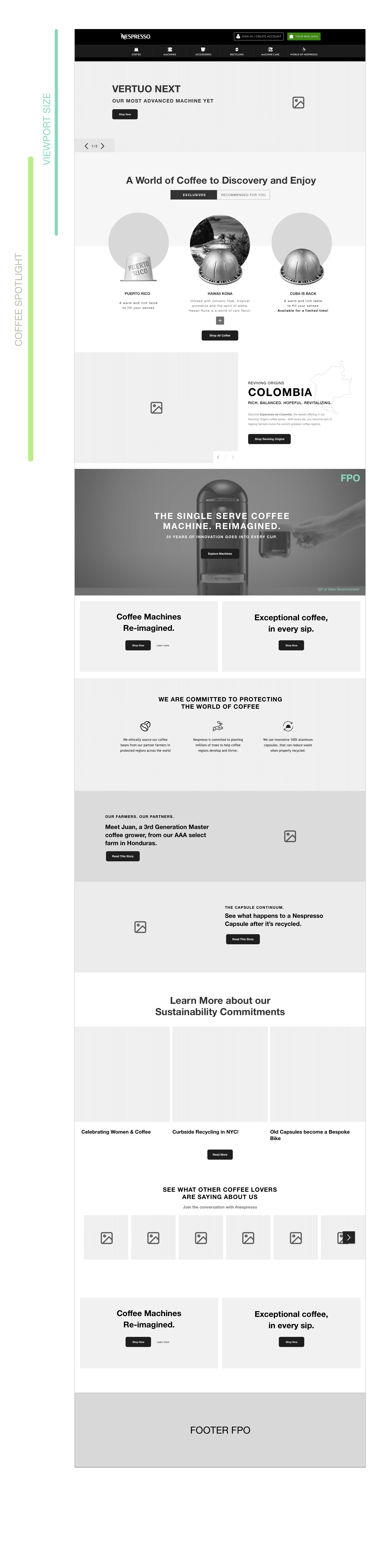
Wireframes of the logged in homepage.
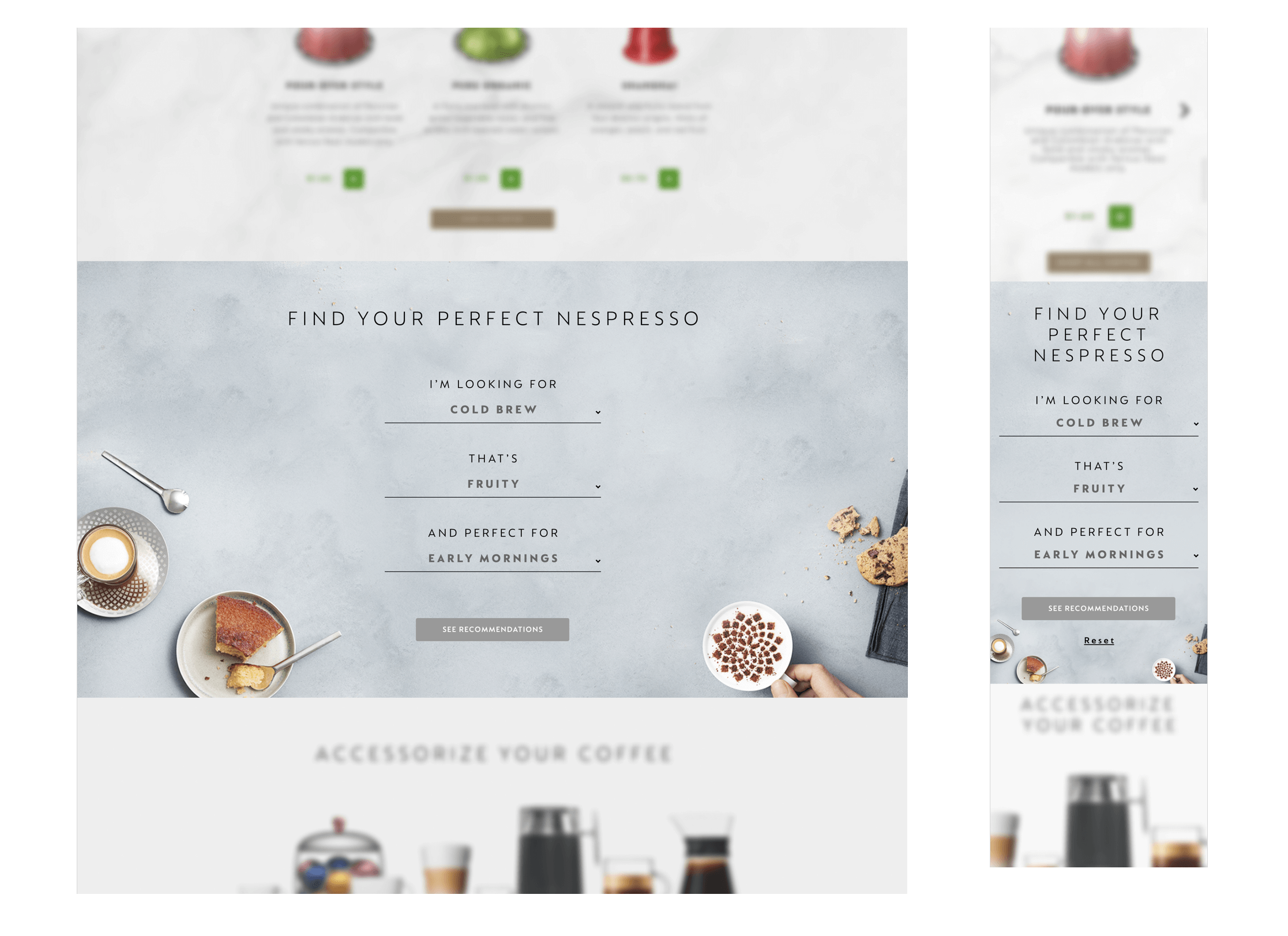
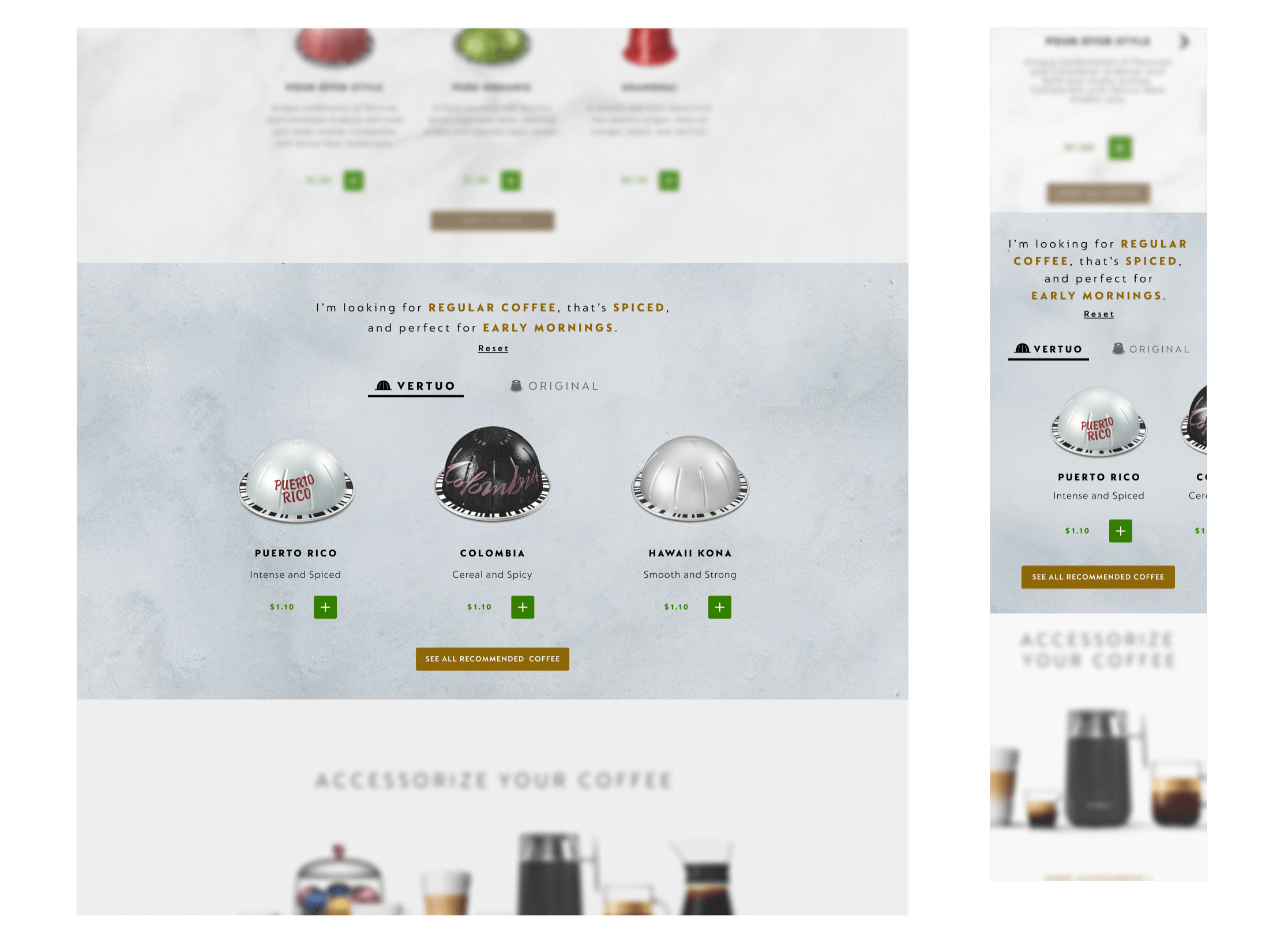
During the wireframing phase we added an interactive guide selling module. We were keen to explore new ways to help new and existing customers to find the types of coffee they were interested in. I based my designs on a previous guide selling module I designed during the WW project that was very successful. The module acted as a product finder using three dropdown menus to allow the user to make selections. Once the user has made their selections, they are shown an array of matching products. This module acted as an alternative, interactive pathway to product.

Wireframes of the guided selling module.
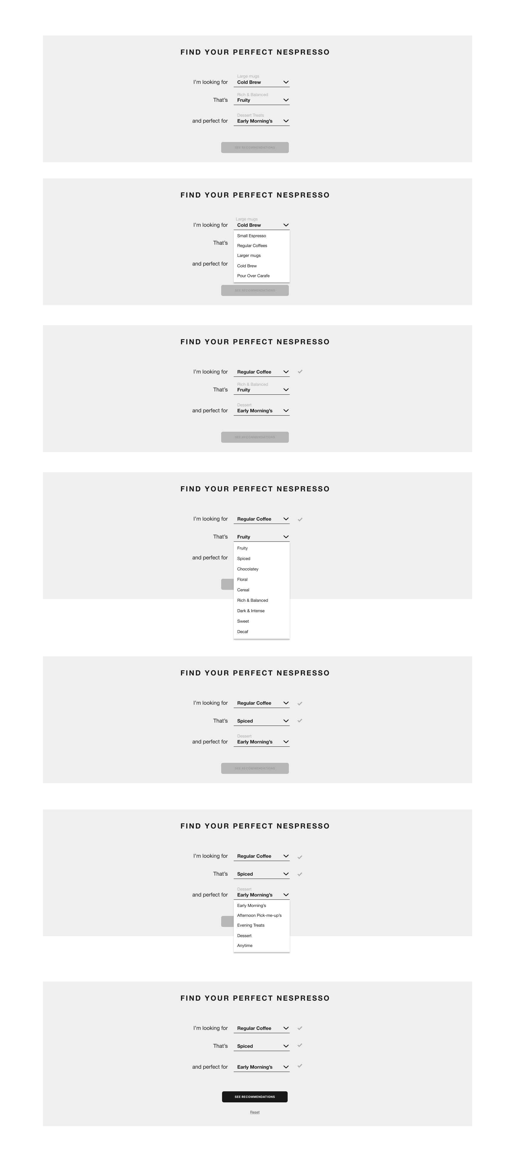
Different states of the guided selling module.

Gif of the guided selling module.
We iterated through a few variations of the wireframes before moving into the final design phase. Our Sr. Visual Designer led the design effort, applying the Nespresso style guide and bringing our new modules to life. I worked closely with our design team to ensure the wireframes transition smoothly into final designs and each module and interaction was displayed as intended.
Once the designs were approved by Nespresso, we sent them to the Nespresso development team to be implemented into the existing site. I wrote the technical annotation document for the Nespresso dev team to work from.
In 2021, our team was excited to fin out that our Nespresso homepage design won the W3 Gold Award for best homepage! 🎉
You can view the Nespresso homepage here
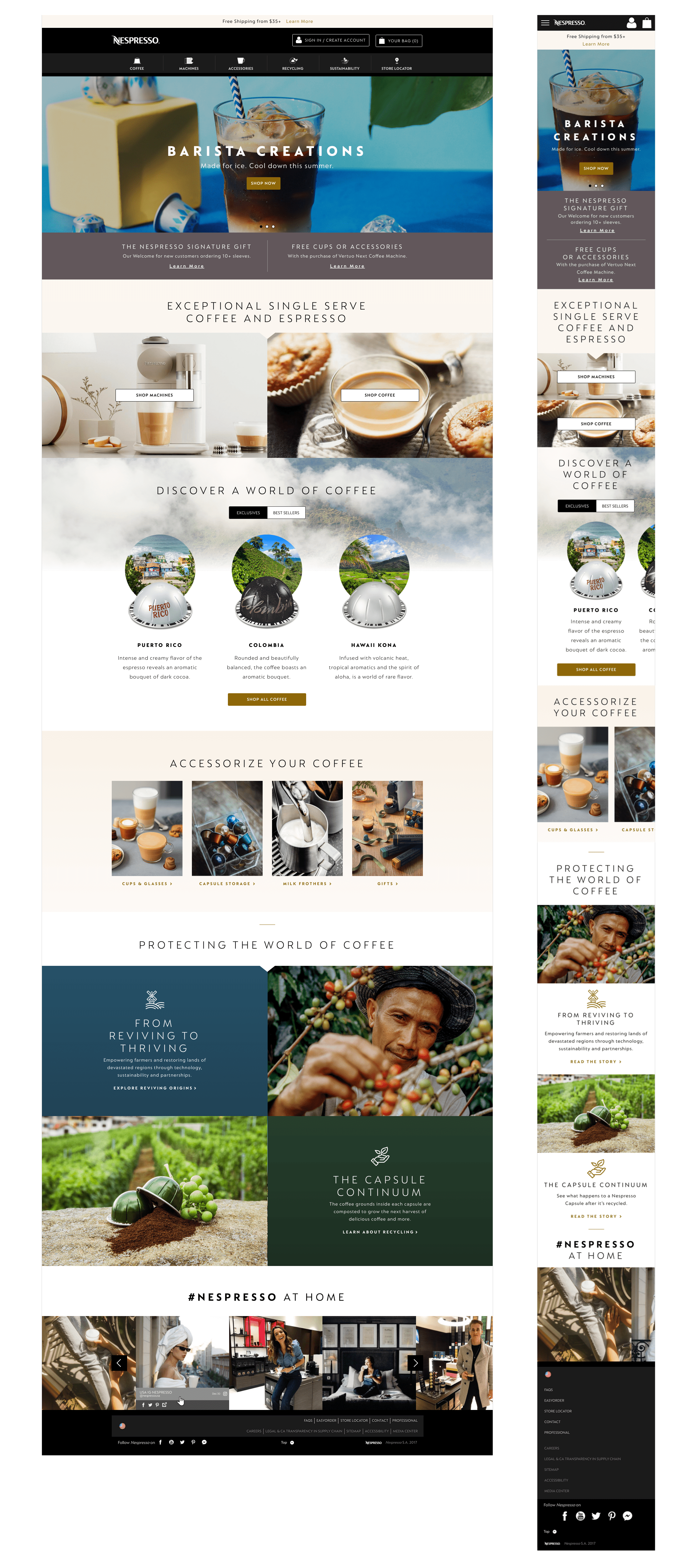
Final logged out homepage designs.
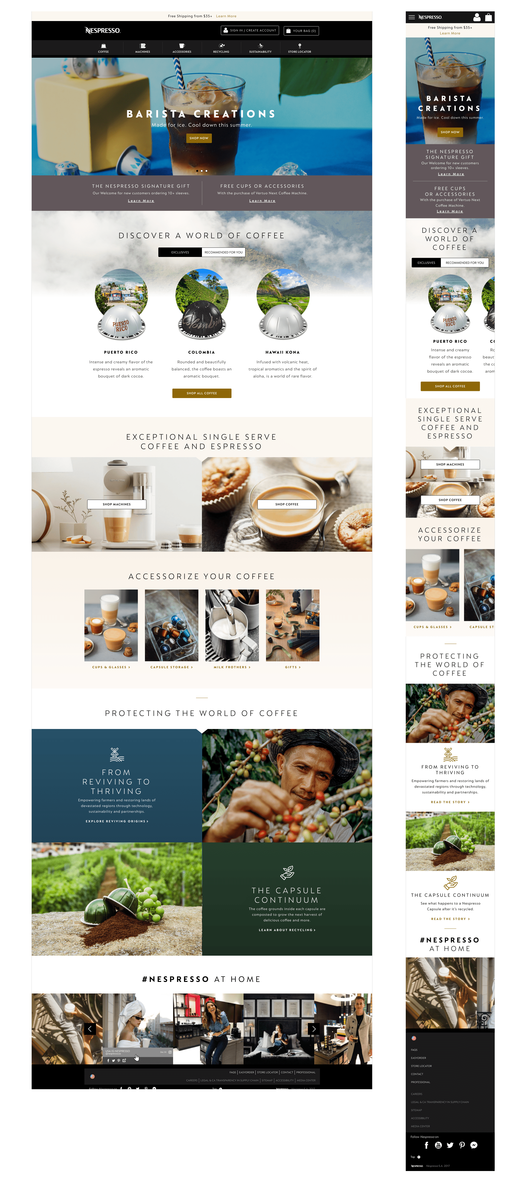
Final logged in homepage designs.
Final guided selling module on the homepage designs.
Final guided selling module on the homepage designs.