Since 2018, I’ve had the pleasure to work with one of the world’s most recognizable coffee brands, Nespresso, on a variety of projects ranging from strategic, targeted optimizations on product pages to fully custom digital storytelling pages. Here, I will discuss a number of those projects and engagements engagements.
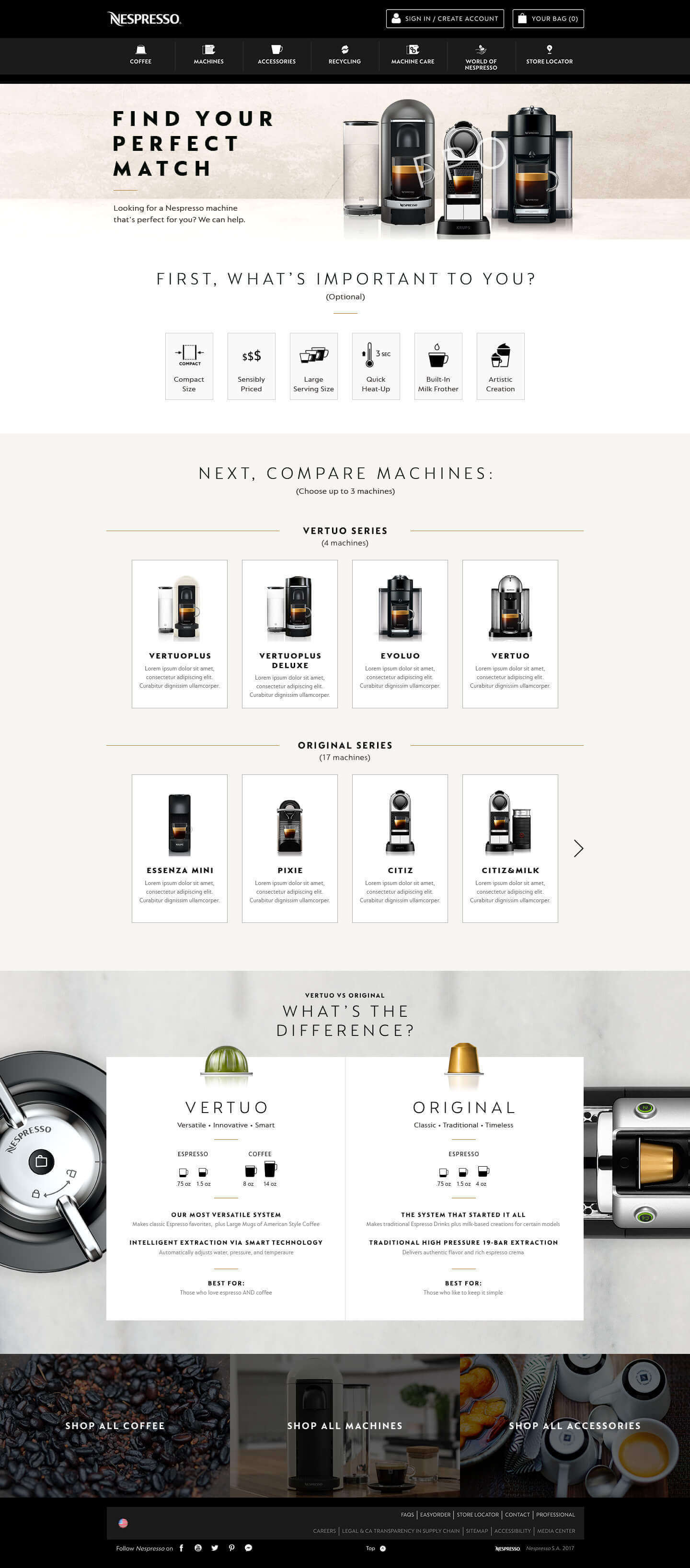
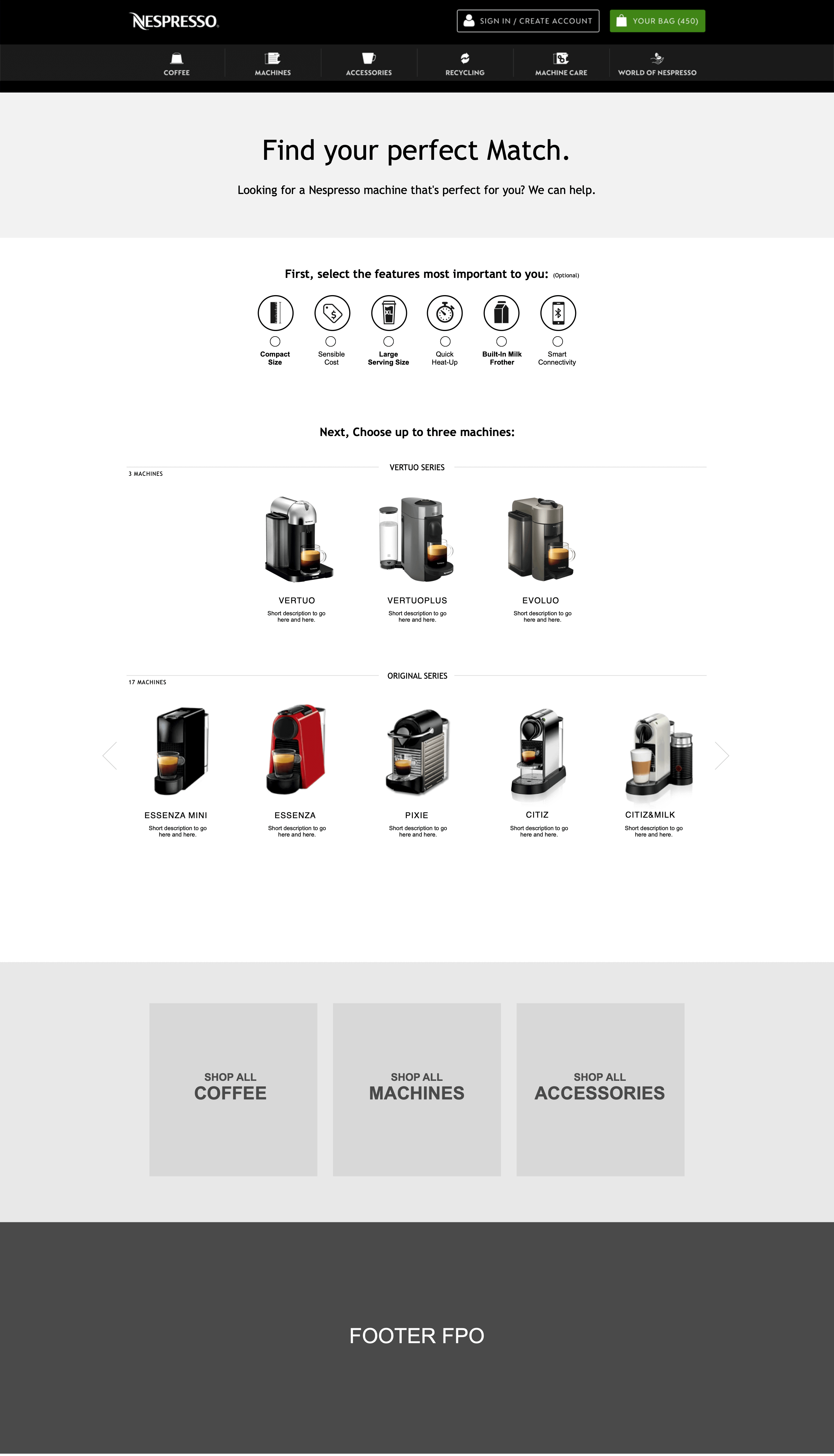
In 2018, I worked with Nespresso on the ‘Machine Assist’ project. The challenge was to create a comparison page for the various Nespresso coffee machines. Nespresso wanted to create a digital space where customers could view and compare all their different machines in one place. At this point Nespresso had dozens of machines with features from ranging from simple coffee making to more complex barista style machines. To make more challenging, Nespresso had released a new type of coffee capsule that only worked in certain machines. It was essential for us to make a simple and easy to use page that would guide users to the machine that best suited their needs and then funneled them to purchase.
For this project, I worked as part of team of three people, with a visual designer and an associate UX director who provided help and guidance with ideation, sketching and wireframing.
During the ideation phase we sketched out a number of layouts and designs. We knew from the beginning that we wanted to avoid making a large table of products where the user was left to trawl through rows of products and search for the features they liked. We wanted the experience to be simple and focus on displaying the products that suit each individual user. We knew from out research that customers had a variety of needs when looking to buy a coffee machine, such as cost, technology, or barista functionality and we wanted to leverage these to help find the most relevant products.
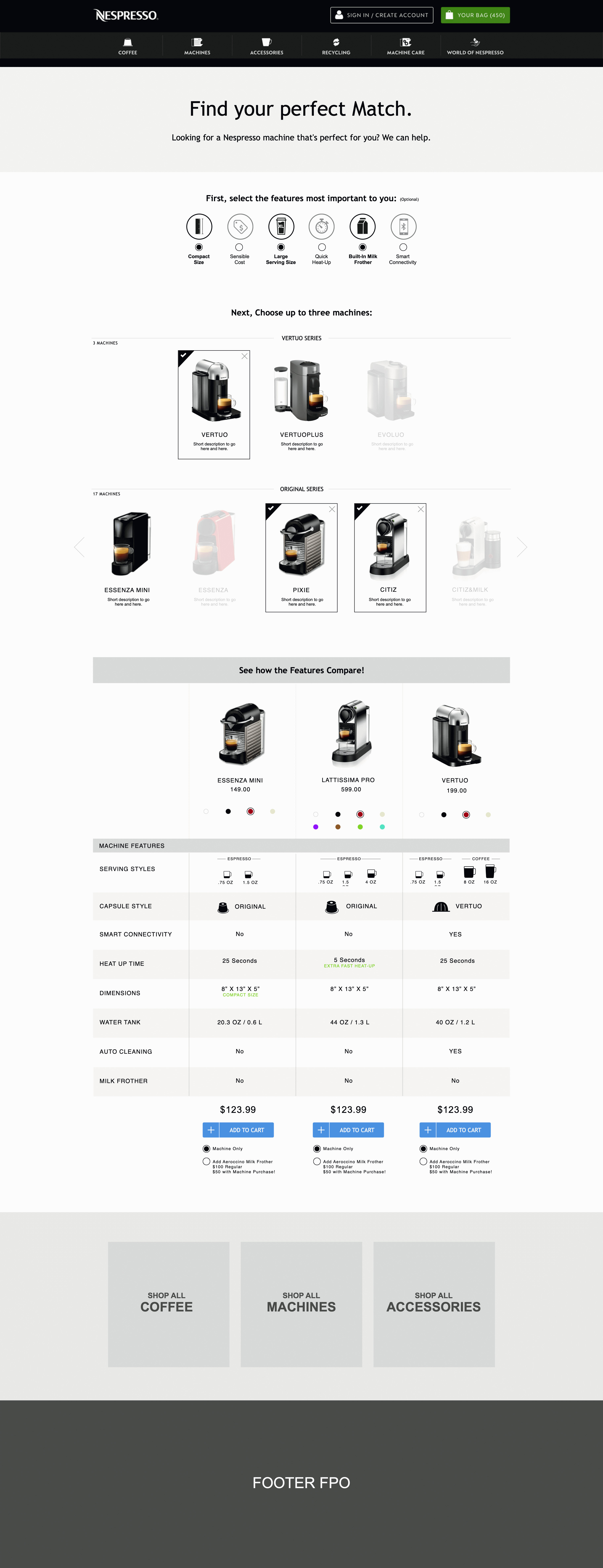
We sketched out a ‘needs filter’ that allowed users to filter products by their needs. It contained filters such as ‘Sensible Cost’, ‘Compact Size’, and ‘Large Serving Size’. This would allow users to quickly focus in on the products that meet their needs.
I worked with the associate UX director to sketch out the rest of the page.
After the ideation and sketching process, I then began wire framing the designs and working out the finer details of each interaction and use state.
I designed the ‘needs filter’ with large icons and text to make the process quick and clear and allow the user to contemplate themselves what kind of machine they would like.
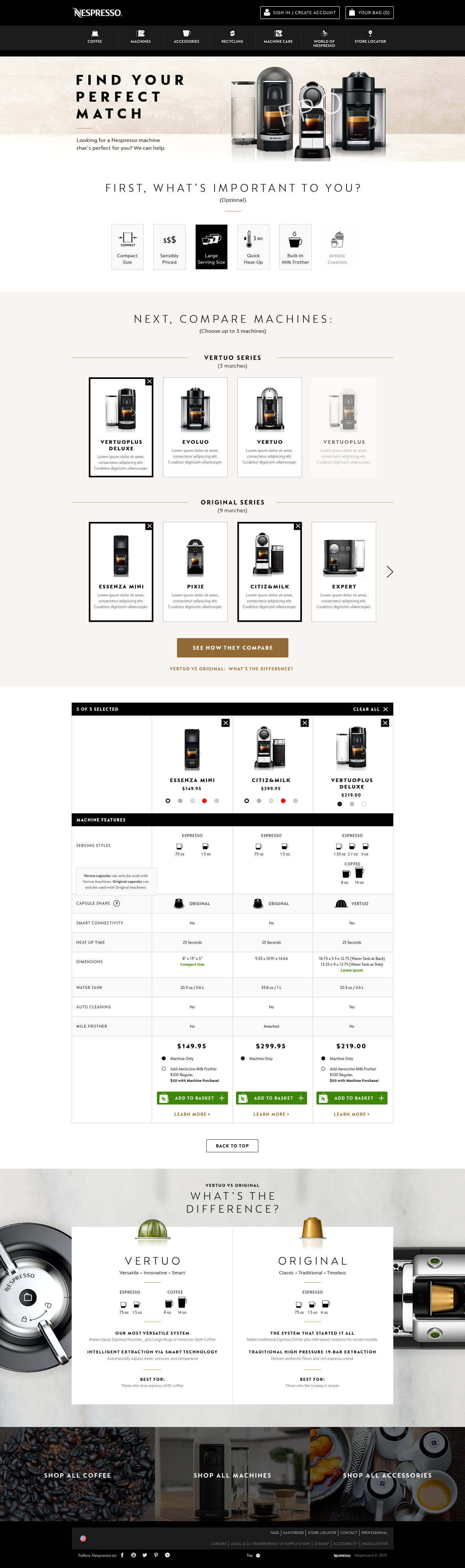
Underneath the ‘needs filter’ I designed a space to hold machines from both capsule lines, ‘Original’ and ‘Vertuo’ and allowed the user to select up to three machines to compare in a dynamic comparison chart. We opted to limit the the comparison chart to three machines as we were conscious of presenting too much data and information in the comparison chart as well as the ability to display the module on mobile. We opted to instead make it incredibly quick to add and remove machines to the chart.
The comparison chart was tricky to design, especially on mobile as it had to hold a lot of information, icons and product tiles. I created a number of variations and with feedback from the team refined the chart into a digestible and informative module.
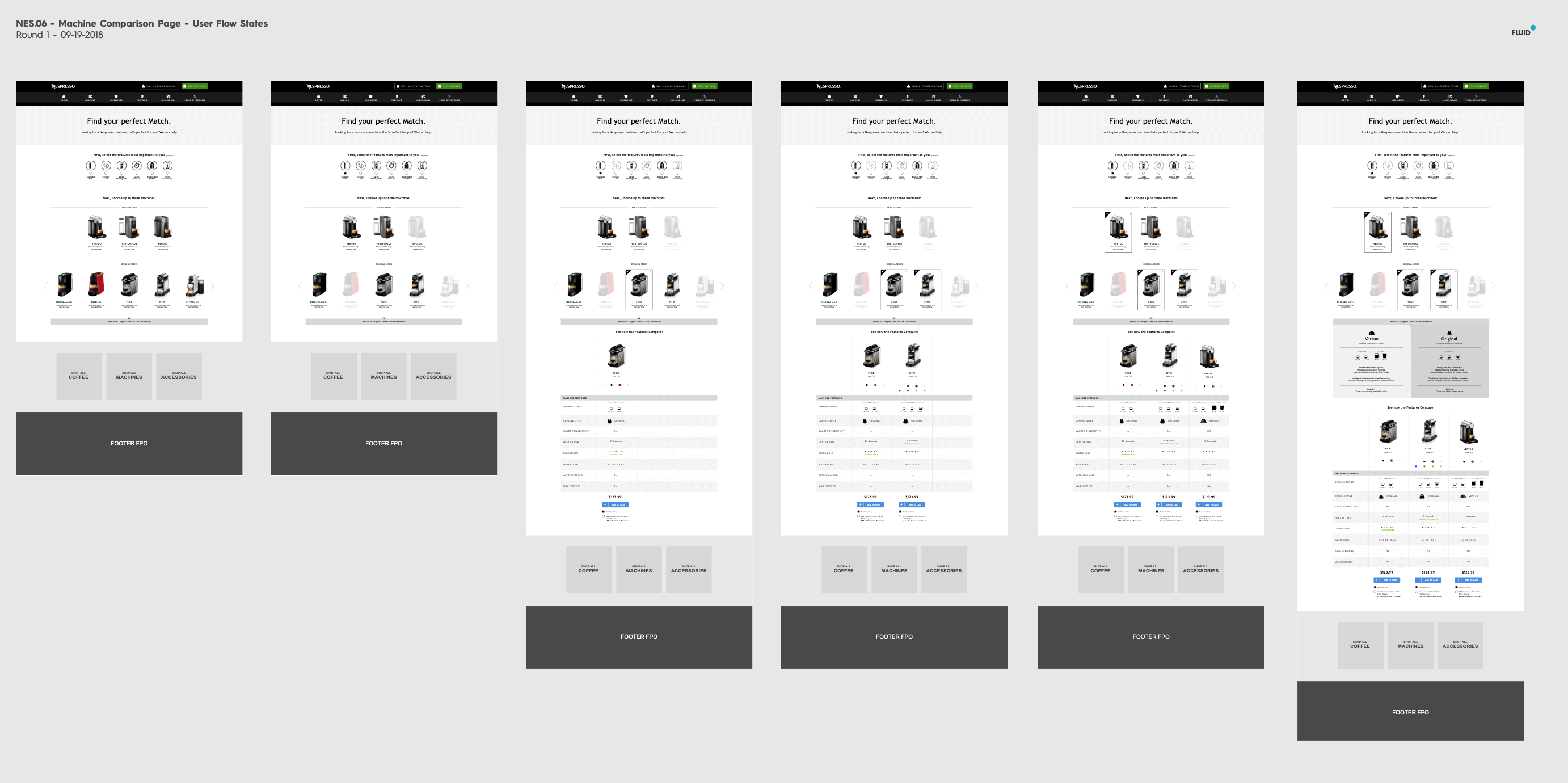
Overview of some desktop wireframes.
Due to the narrow width of mobile devices, on mobile, we would either have to have a side scrolling comparison chart or limit the chart to two columns at a time. I wireframes out both designs and prototyped them to assess the usability of a side scrolling chart and this led us to limit the comparison chart to two columns on mobile.
Due to this limitation, I designed a sticky scrolling header that would allow users to quick-change between different machines. This would help mitigate the limitation of two columns as user could quickly remove and add another machine to compare.
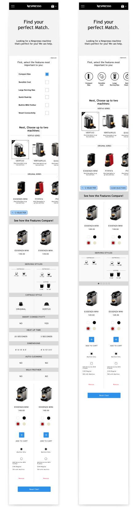
Mobile wireframes showing different filter layouts.

Mobile wireframe ofcomparison module.
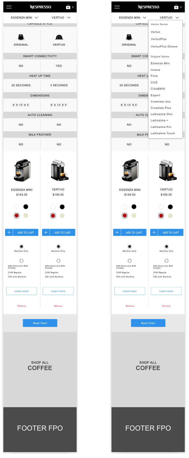
Mobile wireframe showing sticky header and dropdown.
After some rounds of wire framing and refinement, I sent my designs over to our visual designer who brought them to life using Nespresso’s established style guide.
After visual design was complete, I annotated the designs and worked with the implementation team to make sure the complex functionality worked as intended.
We presented the final designs to Nespresso and their feedback was extremely positive. I was also extremely happy with the final designs, the team had created an elegant and dynamic page that allowed users to find the product that best suited their needs. Additionally, users could customize products and add them straight into their cart alongside a number of cross-sell products. I felt that we succeded creating a page that assists users who are shopping and caters to their needs rather than overwhelming them with jargon and technical specs.
Nespresso plan to implement this new page into their US site in the near future.