WW (Formerly Weight Watchers), had just completed a full brand redesign, with a new focus on wellness. Our agency was tasked with redesigning the WW eCommerce site and to create a personalized and inspiring shopping experience.
As WW is a global brand, we needed to create a site that would work internationally and across multiple regions.
I worked as a Sr. UX Designer, alongside a strategist and Sr. visual designer with the oversight of an associate UX director.
Some wireframes from the application.
Customers can buy products off the WW online shop, but the vast majority of their customers subscribe to the WW program. These users have a variety of different goals ranging from healthy living to weight loss to overall wellness. To create a highly personalized shopping experience for these members we needed to better understand their needs.
During the early stages of the project I worked with our project strategist to interview users and gather research. We travelled to a WW studio in downtown Manhattan to sit in on a WW studio wellness session and afterwards, interviewed WW studio members.
We found that different WW members have very different needs, with many users buying only specific food types for specific uses. Their wellness needs were highly personalized, with some users needing high protein food or gluten free foods and others needing food for specific uses like office snacks or gym workouts. This would later lead us to create a ‘solution’ oriented shopping experience.
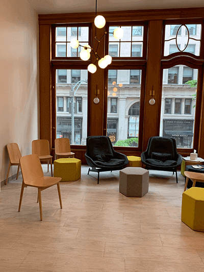
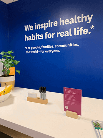
Visting a WW member studio.
We also conducted additional research using web analytics and WW’s own user research documents. Altogether, we gained a strong insight into WW’s customer’s needs and this allowed us to create three user personas and four user need states.
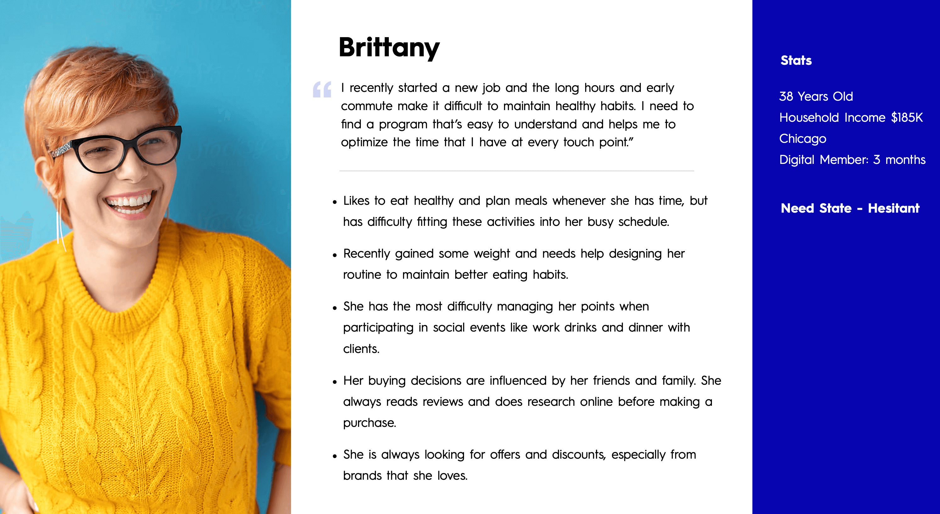
One of our developed personas.
Using these personas and our research, we built out three user journeys that illustrated how we could engage users outside the eCommerce experience and bring them through to checkout.
As we conducted research and created the personas, the team started to ideate and conceptualize different modules. Some of these included a type of guided selling module that could help users discover products that suit their personal needs, an ingredient module to transparently explain product ingredients and a customer dashboard that would help regular customers reorder favorites and find similar products.
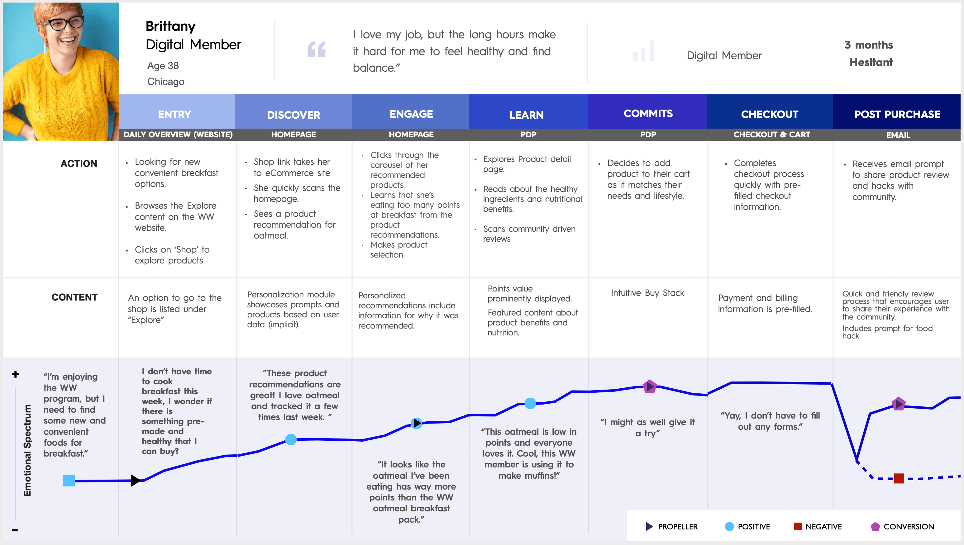
A user flow created during the research phase.
Once the research phase of the project had ended we began the sketching and wireframing process. We broke the project down into 4 major sprints, each containing two major website sections.
Sprint 1: Navigation, taxonomy and the product page.
Sprint 2: Cart, checkout and product listing page.
Sprint 3: Homepage and Landing page.
Sprint 4: Category page, guided selling modules and personalization modules.
We designed the site with 3 main user types in mind, guest users, users with store accounts and users with full WW membership. This required us to rethink each page so it showcased relevant modules and and content for each user type.
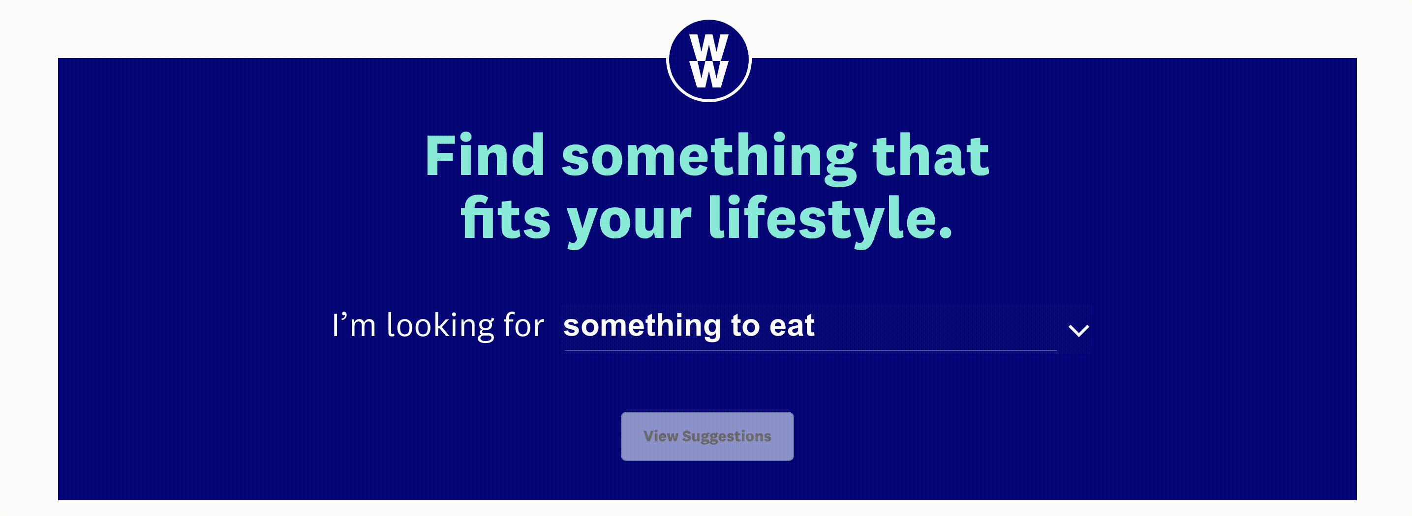
For sprint 1, we used the analytical data and user research to sketch out and ideate the basic site taxonomy and navigation menu layout. We opted to allow users to shop by product type but also by product solution. This would allow users to navigate to a specific product or find a product that works for their lifestyle.
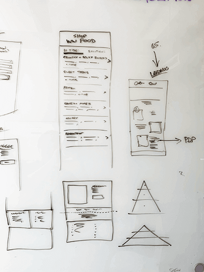
Sketching the navigation during sprint 1.
Working with the team, I sketched out concepts for the product page. We wanted to create a modular page that could contain an in-depth ingredients module and personalized ‘Why you’ll love this module’.
After sketching and ideating, I wireframed out the designs in sketch, creating multiple states and layouts for different products and buy-stacks.
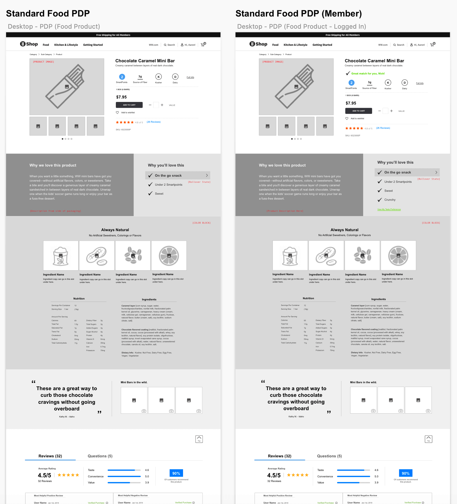
A section of the desktop PDP wireframe during sprint 1.
Sprint 2 was challenging as it was a very technical sprint as the cart and checkout experience contained multiple flows, each with many different page states. For example a user can checkout as a guest or a logged in account member and may have a variety of personal information previously saved. I wireframed the entire cart and checkout flow for each user type for both mobile and desktop.
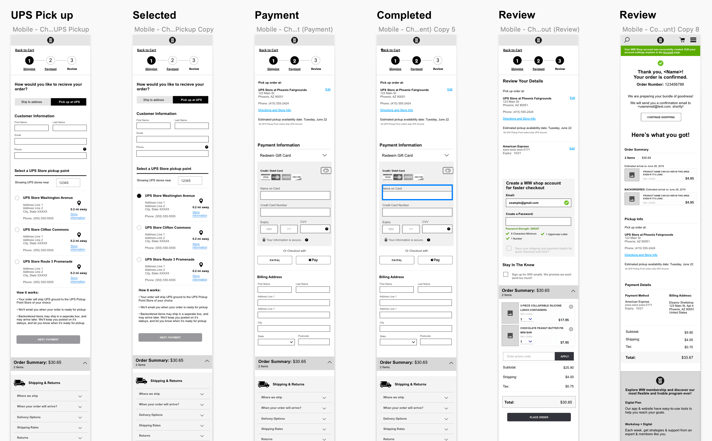
Part of the mobile checkout wireframes.
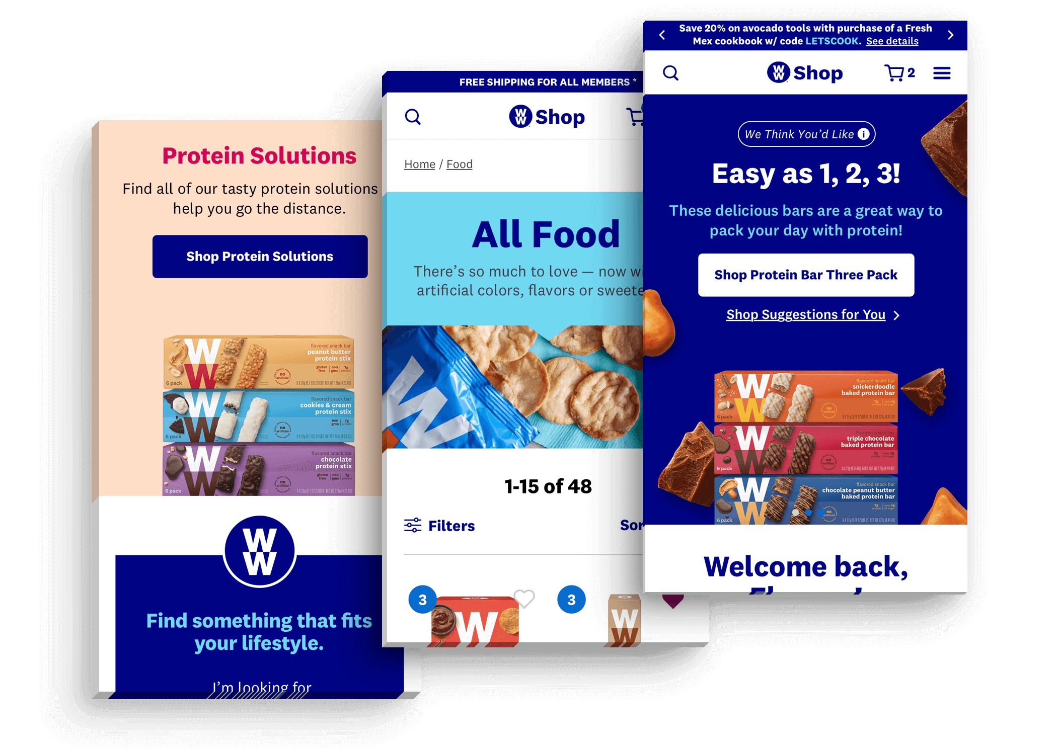
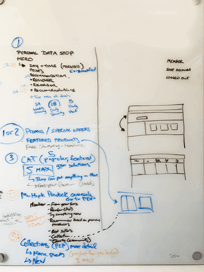
The main challenge for sprint 3 was the homepage. This would be many users’ first impression of the site and it needed to be impactful. I sketched out and wireframed 3 variations of the homepage, one for each user type; guest user, shop account user and WW member. Each variation prioritized different modules. For the member account version we developed a personalized shopping module high up the page called 'Just for you', which allowed returning users to shop favorites effciently. The guest version focused on introducing users’ to the WW program and WW products using promotional modules and the guided selling module.
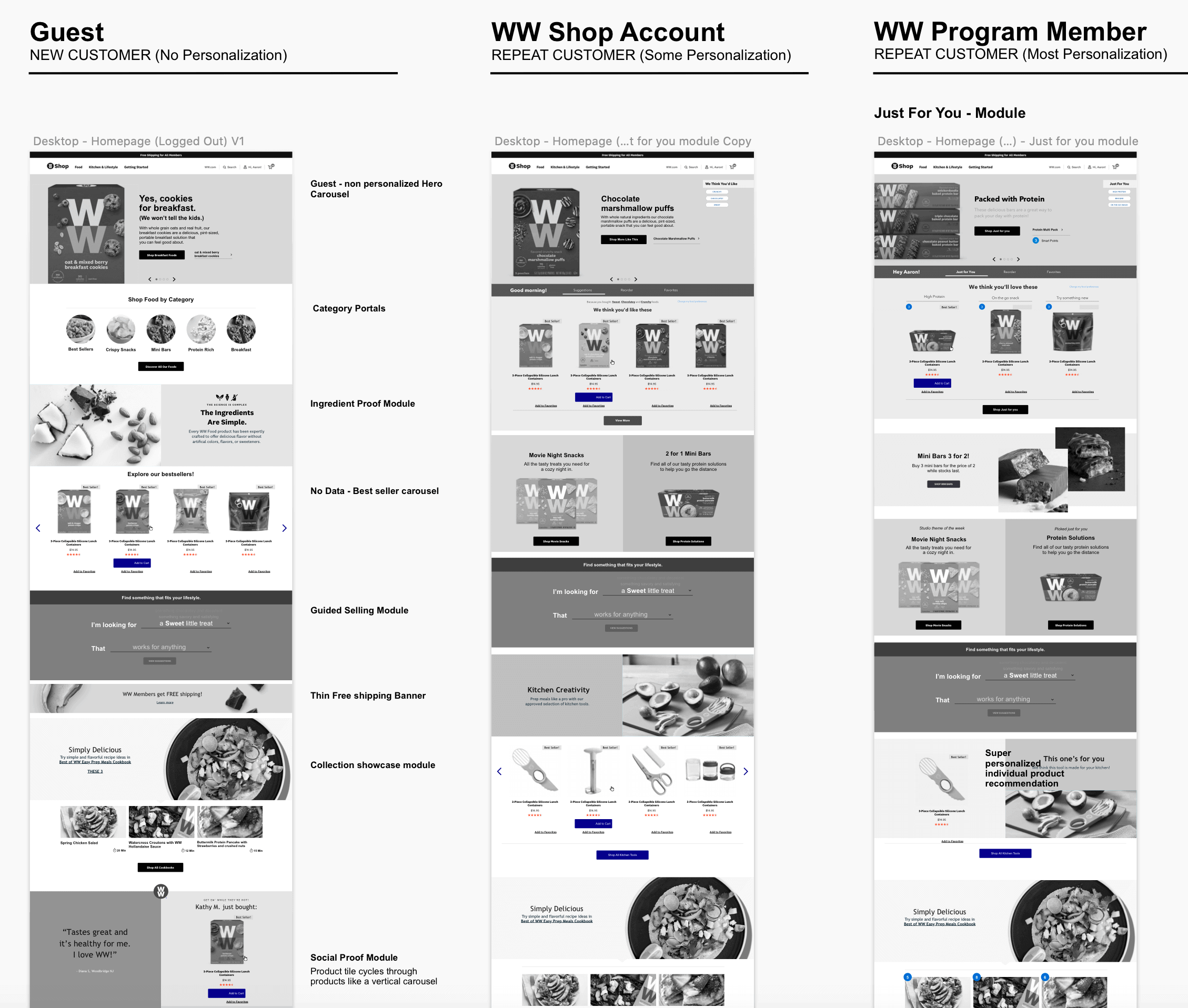
Some variations of the homepage showing different module layouts.
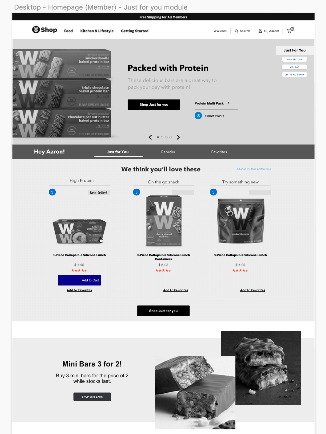
Detail of the 'Just for you' module on the member homepage.
During sprint 4 we focused on fleshing out the personalization and guided selling modules. Throughout previous sprints we started ideating on a personalized ‘tagging’ system, where each product could be tagged based on its attributes and the solutions it works for. For example, a product could be; Salty, chewy, high protein, post-workout snack and a great on-the-go snack.
I also sketched out and designed an interactive, natural language, guided selling module that would guide users to products that suit their needs by asking questions about their tastes and lifestyle needs.
The guided selling module was highly interactive so I prototyped it in UXPin to test it during our user testing sessions. The feedback allowed me to refine the module further and make sure it provided value to users.
View the live prototype
Short video from the guided selling module interactive prototype.
At the end of each sprint, I worked with the Associate UX director to test our designs and get feedback from users. We created a testing document with a number of questions as well as wireframes and sometimes interactive prototypes to test with users. Due to the short duration of the project, we opted to use a third party testing group to gather the users and conduct the tests based on our testing document. We then used the feedback to refine our designs.
At the end of each sprint, after user testing and refinements had been made, I handed off the wireframes to our visual designer. They expanded upon the WW style guide to bring each page and module to life.
Once the visual designs were complete, I would go through each page and annotate every module for the development team.
When the annotations were complete, I worked with the visual designer and the development team throughout multiple QA sessions to ready the designs for implementation.
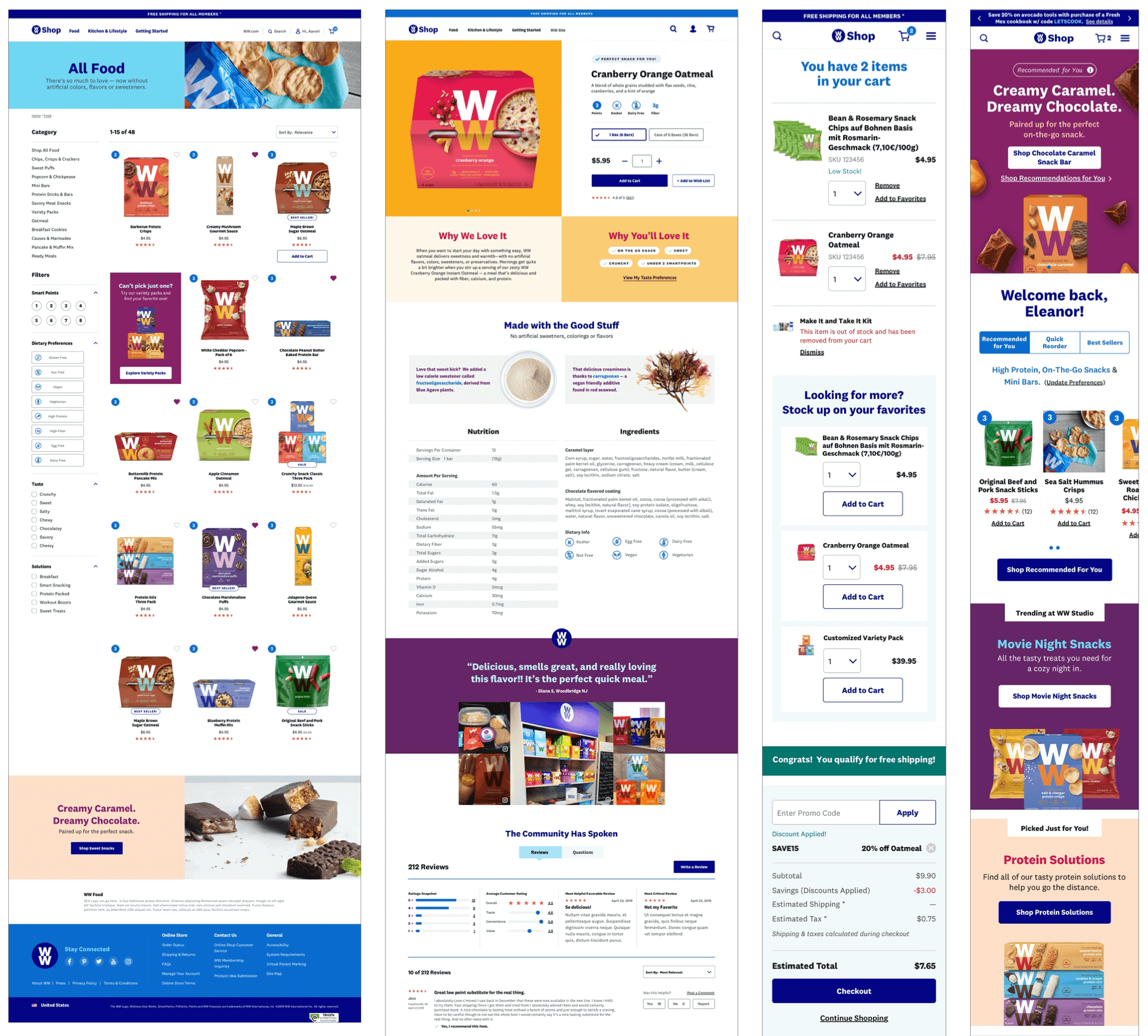
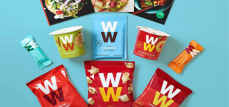
A selection of final visual design wireframes, stunningly brought to life by our Sr. visual designer.
I’m extremely satisfied with how this project turned out and the feedback from the WW team was overwhelmingly positive. I was proud to be part of this project from the initial research phase all the way through to wireframing and user testing. I’m particularly proud of the natural language guide selling module, which is something I conceptualized myself and later brought to the team. I developed it from a simple idea into a key module within the WW shop experience.
The new WW eCommerce site is being rolled out in phases and can be seen here.