This project was created as part of my masters degree. The goal was to research, design and develop a mobile application over 5 months. I worked as part of a team of two people and we based our initial app idea around a social travel concept. We were both avid travelers and felt there could be potential in creating a digital space for other travelers. My role in the project was wide ranging and included conducting user research and interviews, building and testing wireframes, designing the UI and visual look of the application as well as front and back-end coding.

In the end we created Wander, a digital common room for backpackers and travelers that connects travellers and facilitates their need to socialise while they are travelling. We developed a forum where users can send messages, initiate activities and seek advice with other travellers near their current location.
The process of creating this application is documented below.
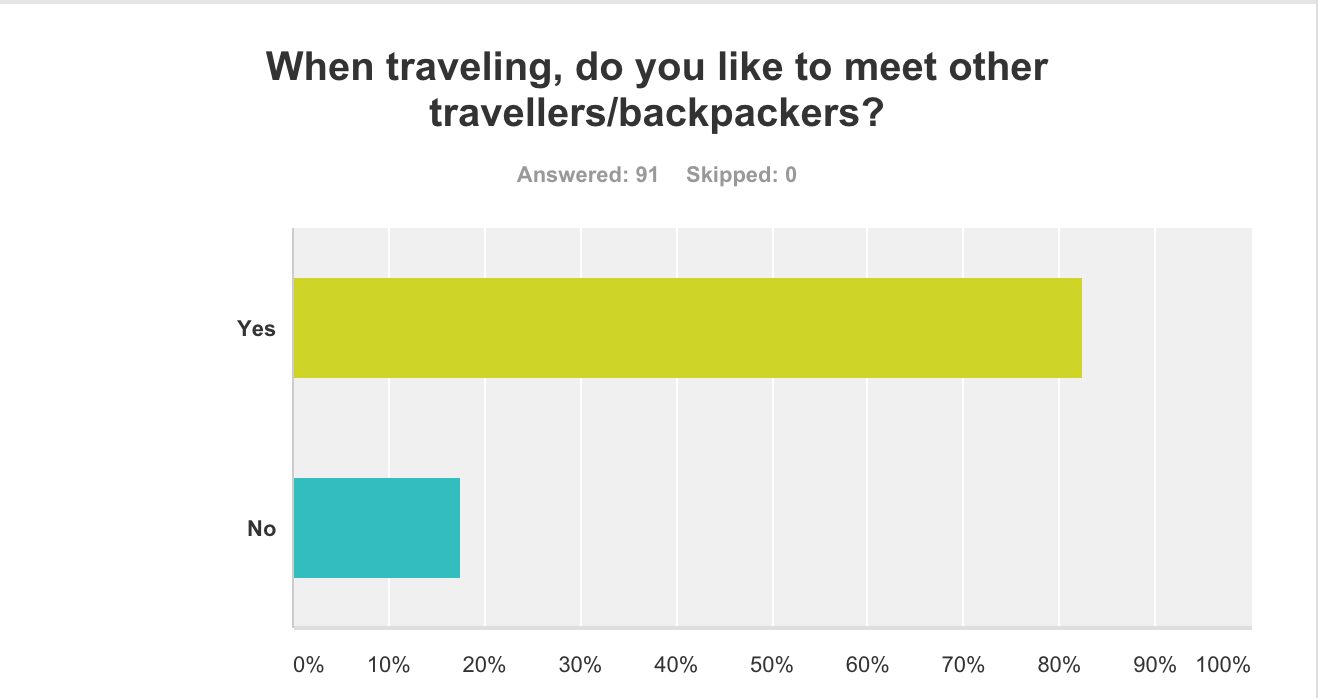
During the initial stages of the project the primary functions of the app were solidified through research and surveys, which were conducted with potential users about their needs. We surveyed just under 100 potential users on travel forums and online backpacking groups to identify if there was a need for our app idea and to see how we could best address those needs. We questioned users from a wide range of countries including Ireland, Argentina, Norway, USA and Mexico to get a wide sample size of repsonses. We gathered a lot of interesting data about traveling demographics and behaviour, including age ranges, smartphone usage when traveling and travel group sizes. We also found that 82% of respondents would like to meet up with and connect with other travelers. This data helped validated our idea that there was a desire for an online social space for travelers.
During this period we also investigated what the most important features of a social travel app by interviewing travelers in a Dublin hostel. The interviews highlighted privacy as a number one concern when traveling as well as the ability to find about events and information in the areas that they are traveling. We found that a lot of younger travelers under 30 found the social aspects of hostels to be incredibly rewarding and informative. There they can meet and connect with other travelers, hear about things to experience and get travel information about the area they are in. We also observed that in travel forums such 'Lonely Planet' that many travelers seek out information and tips from other travelers in the same area.
These insights allows us to focus in on the main role of application and see how we could address user needs. We wanted to create a digital common room that travelers could easily access on their phone. Users could find and create posts about events, meetups asking for travel advice and having a way to connect with other travelers while on the move. We were also interested in using geo-location as a way to provide relevant results to users so they would see posts created by others nearby.
Analyzing the feedback we also identified a number of user needs and pain points that we wanted to address.
Key Insights:
1. People want to meet other backpackers and travelers when they are traveling.
2. Travelers want to ask questions and get honest and relevant advice from their peers.
3. Travelers want to find off the beaten track opportunities and experiences.
Common Pain Points:
1. Meeting other travelers and finding new experiences is often random chance.
2. There's no consistent place or forum to ask specific travel questions.
3. It's hard to get good travel advice that isn't from major tourist site, eg: Tripadvisor.
With this research we began piecing together use cases and personas addressing a 'To Be' state that would address the user needs and solve the pain points.
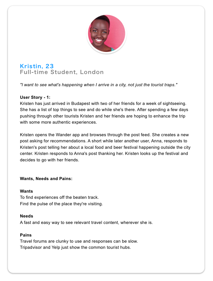
One of the personas that we developed.
With user stories and journeys in place we began sketching out some basic lo-fi wireframes and some rough user flows to piece together a UI that would address all the major use cases.
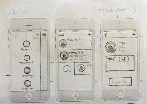
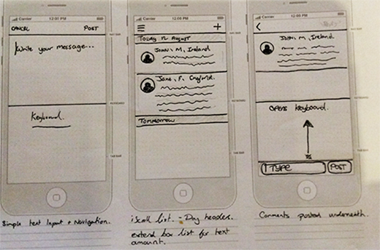
UI sketches for an early version of the messaging system.
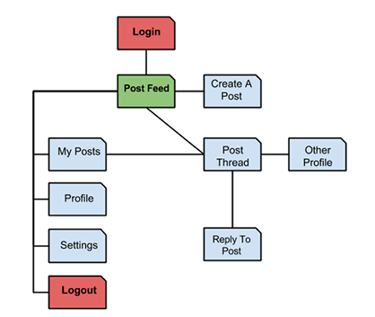
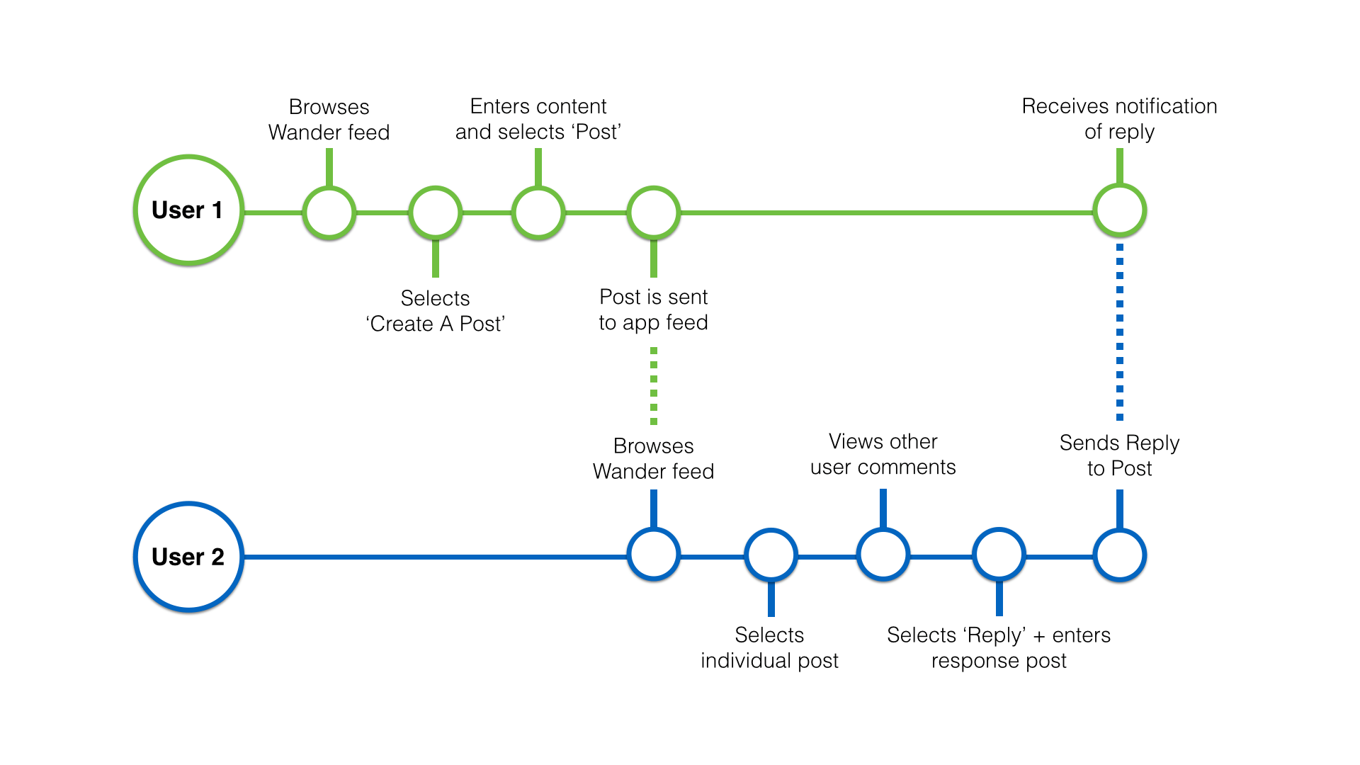
Mapping out the basic architecture of the app.
Mapping out the basic architecture of the app.
We rapidly iterated through a number of prototypes during this early testing phase, making quick changes based on feedback. This testing session focused on validating and refining the flows as well as figuring out how best to lay out the UI.
We created our first prototypes using Flinto prototyping tool and then created a list of tasks to test users. We gave users a mobile with the Flinto prototype and then did not interfere at all as they tried to complete a number of tasks, such as logging in, creating a new post, replying to a post, and changing the post radius. We tested several users and monitored them as they used the application. During the test we observed how much they struggled or succeeded in certain areas and after completing the tasks we would interview them about their experience. We found it important to observe their usage as well as get personal feedback to provide a large picture of the users experience.
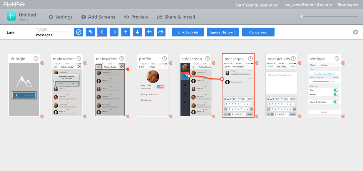
Building a simple prototype using Flinto.
Testing our Flinto prototype with users on a mobile device.
Initial testing feedback showed us that all the users were able to complete the tasks without to much trouble. The original Interface designs for the main content page had a menu button and a messages button in the top left and right corners of the screen and the post button was at the bottom center of the screen. Through user feedback we altered this so the 'create post' button was moved to the top right and messaging was opened up when a user selected a post from their feed. Messaging In the original prototypes was problematic and difficult for users as there was a 'Send Messaging Request' and 'Confirm / Deny Messaging Request' system in place, similar to Tinder. This made socialisation more difficult within the app as users could send, receive and deny personal messaging. Test feedback prompted a change to a more simple comment and reply system that allowed users to easily engage with other people on the app.

Wireframes for an early version of the messaging system.
UI and feature design continued through five prototype variations with a testing and feedback phase occurring with each version. Initially we were planning on creating a friend request and direct messaging system but we received feedback that this system might not be useful. Many users said they were uninterested in using the application as a deep social experience as they already used other applications such as Facebook. Instead they were more keen on a simple forum style communication platform.
One of our main challenges was to provide a sense of trust when communicating with other users so for user login we opted to add a Facebook API login. This allowed for easy login and profile setup for users but it also added some user security as users required a Facebook account to use the application. People are vulnerable when they are in a foreign country so we needed to leverage as much information as possible to show that other users are legitimate travelers while also keeping profiles fairly anonymous. We tested and added a number of features to tackle this, firstly, we used the Facebook API to show how many friends the user had on Facebook. Real legitimate accounts tend to have a higher number of friends. We also displayed the number of posts and replies a user has posted in the application, as this way another user can see how active, helpful, and legitimate a user is.
It was a tough balancing act. We were keen to add a user rating system into the application and it featured heavily in our initial concepts, and user tests but ultimately it had to be cut due to development deadlines. If we continued to work on the application after the project deadline it would have been added. This would have allowed user to have an in-app rating that would show how legitmate and trustworthy a profile was.
Building a simple prototype using Flinto.
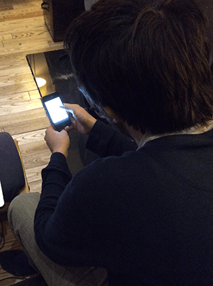
We conducted our final rounds of user testing with backpackers in hostels in Spain and Dublin. This was our final major testing session and we wanted to test the updated forum style messaging UI. This test was conducted on a early version of the application setup on a smartphone. As with previous tests we outlined a list of tasks for the user and observed them until completion before interviewing them about their experience.
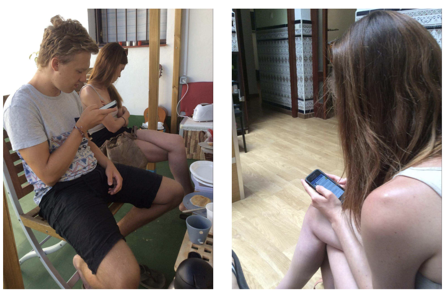
User testing with backpackers in a Spanish hostel.
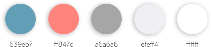
Visual design for the application occurred alongside the prototyping and testing phase. The team put together a number of different colour schemes, icon styles, and logo variations but were not satisfied with the results. As the UI became more solidified through testing the team settled on a light blue and pink colour scheme that made the UI more unique and identifiable.
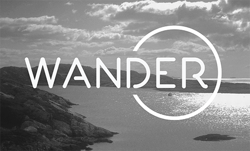
Early variations of the Wander logo.
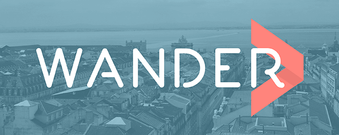
Using this colour scheme several logo variations were sketched out until settling on a final arrow style logo. We began incorporating a folded arrow shape as the primary logo of the application. This symbol loosely tied into the concept of the app and the term 'wander' visualizing movement and direction.
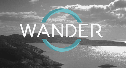
Further developing the Wander logo.
As we settled on the colours the team began experimenting with a translucent layer of colour over scenic images. This idea worked really well as we could now incorporate a selection of travel images into both the app backgrounds and related art, so at a glance the logo backgrounds would be both visually interesting and hint at the nature of the application. The translucent backgrounds also allowed us to place consistent white text over almost any background.
Further developing the Wander logo.
Further developing the Wander logo.
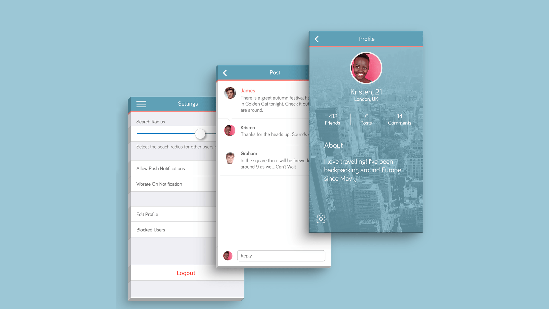
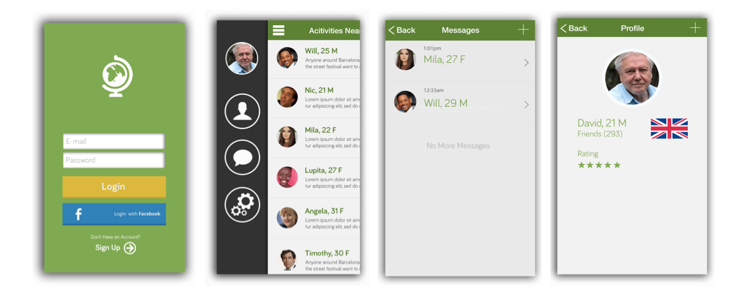
When the visual design and UI testing had been completed, we put together our final design. At this stage we had coded the applications front and backend and had it running on mobile using phonegap. Our MVP app allowed users to log in with their Facebook credentials see posts from other nearby users through geolocation. Users could also create their own geotagged posts and respond to each other in a reply thread style, as well as manage their personal profile and settings.
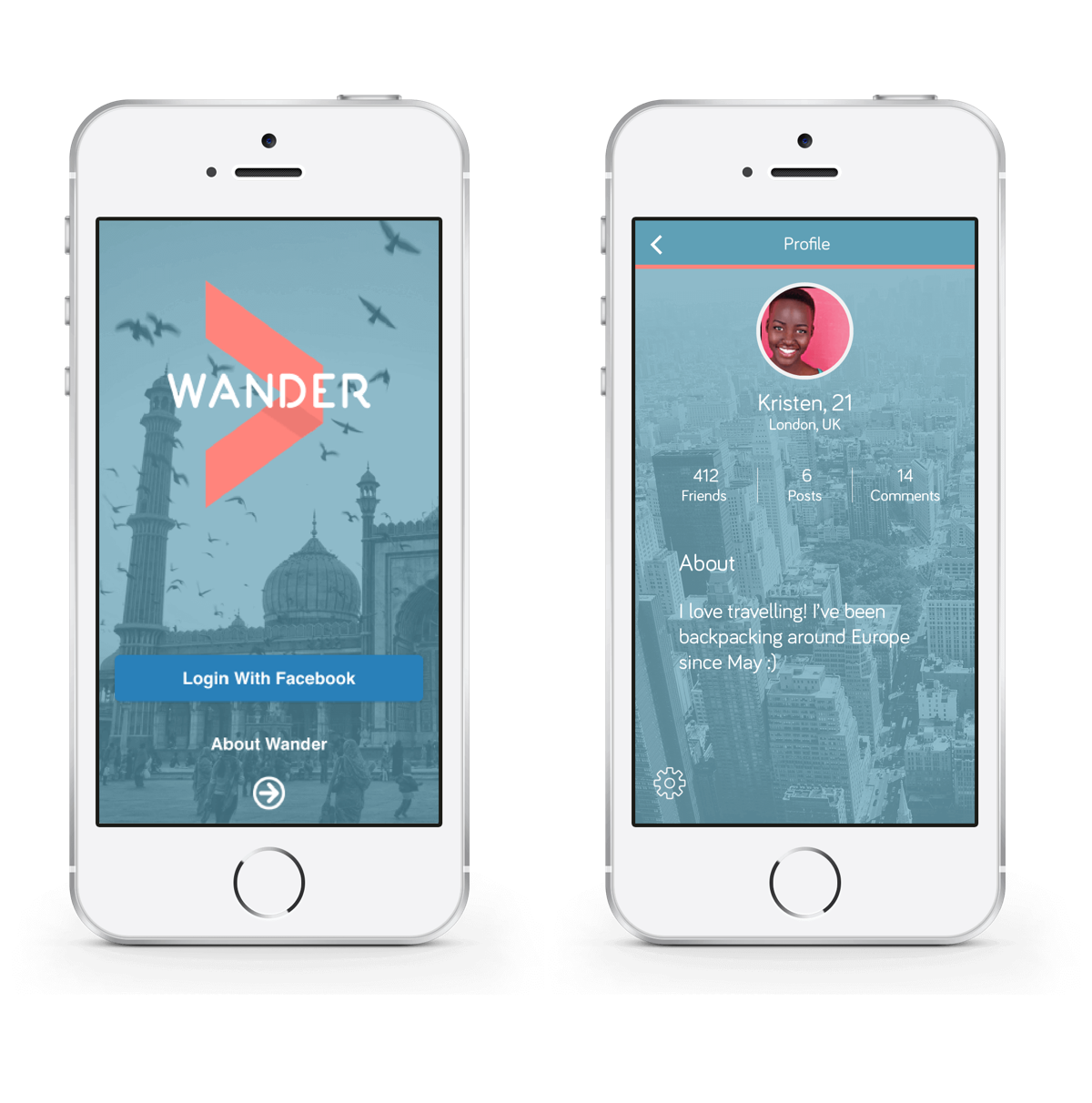
Login and profile pages.
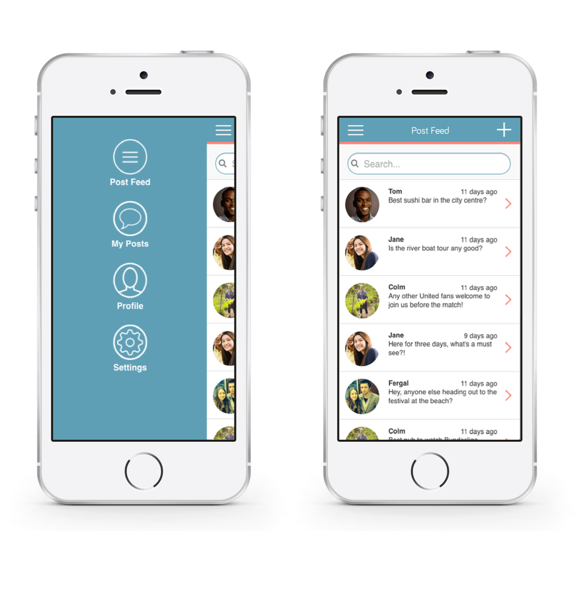
Main post feed and side menu.
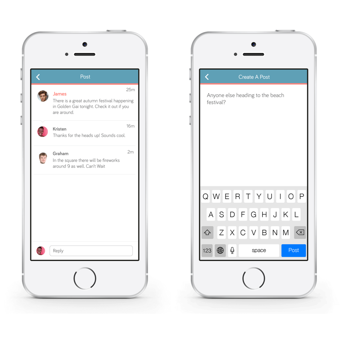
Post thread and create a post page.
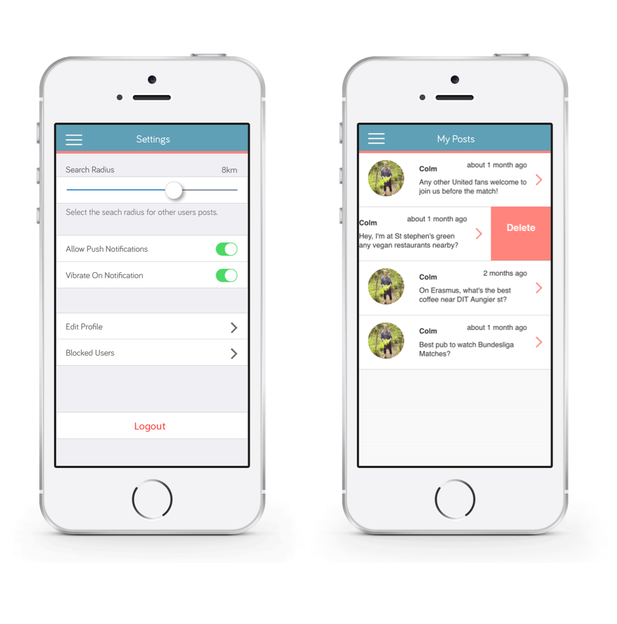
Settings and my posts page.
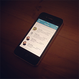
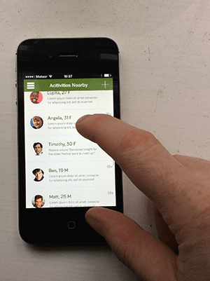
Live app running on iPhone.
We were extremely happy with the final application. As a team of just two people we had a lot of different roles to fill and in the end we managed to deliver a fully realised MVP that addressed all of our use cases. I personally learned a lot working in different roles and seeing how each step of the project transitioned into the next. Although being so closely involved in each aspect of the project was a great learning experience, it definitely hindered our progress to a certain degree. If there were more members of the team in dedicated roles I'm sure we could have expanded our project scope and achieved more. The biggest personal challenge in this project was the coding. Both team members are not trained developers so we initially struggled in certain areas but eventually we were able to achieve what we had set out in our designs. Being a part of the backend development was extremely rewarding and gave me a better insight into how to engage, communicate and collaborate with developers.
I felt the app had a lot of potential and we had a lot of ideas to expand the features and provide an even better product, but due to our hard development deadline we had to work primarily towards our MVP. Based off of our research there were a number of areas we would have expanded upon if we had continued the project. Firstly we would have fully implemented a ratings system into the application. Our research indicated a positive only feedback system would be ideal so travelers could give the equivalent of a 'thumbs up' if they recommended a user. We were also interested in expanding the questions and information side of the application and allow people to see and create post from other parts of the world. This would allow users to ask questions before they arrived at their destination. This was something we were close to implementing but had to be postponed due to time constraints.