Success 360 was an internal IBM project to improve and optimize how IBM offering managers could oversee SaaS offerings they manage and locate key information about different IBM SaaS offerings.
The problem at the time was that IBM offering managers had no unified platform to view the multiple SaaS offerings they ran, or search and view other active offerings. Offering managers would normally use a multitude of different programs and outdated links to track the performance of the different offerings they managed. Similarly, offering managers had no way to view other SaaS offerings and see who worked within them, this was often critical, as offering managers would need to reach out to other offering managers working in similar spaces and developing similar SaaS offerings.
I worked as part of an internal development team as the sole UX designer under the guidance of a project manager. At the beginning of the project I conducted user research by setting up interviews with 11 different offering managers across 4 IBM business units. I prepared an interview script and talked with them about the problems and issues they faced on a daily basis.
I uncovered a lot of pain points that highlighted how slow and cumbersome it was for managers to complete simple keys tasks relating to their jobs. I was told how managers how little to no data insight, a lack of agility, limited access to information and communication issues at scale. There was a huge waste of productivity and enormous time sink, as offering managers spent hours searching for different users emails, trawling through wiki's for information, and moving between different managing platforms.
In addition, managers would spend countless hours tracking down analytics for the offerings they managed to see how it was performing financially and with users. This was a huge problem as managers were often left in the dark and had no insight into how to improve their SaaS programs.
"Our offering has no built in analytics so I can’t see details about our products. I need to know the people and key figures to communicate with to get this information as it is spread around."
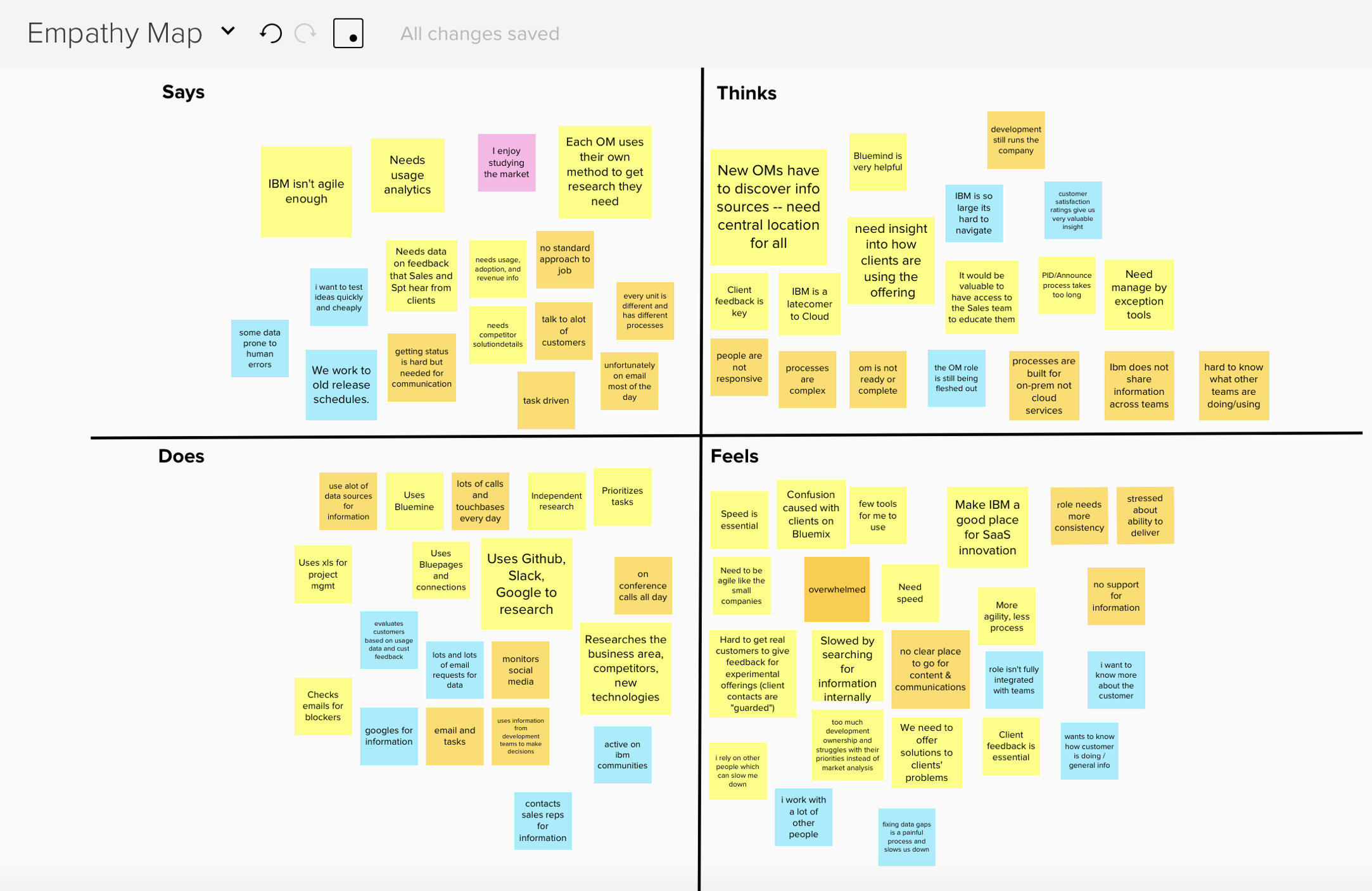
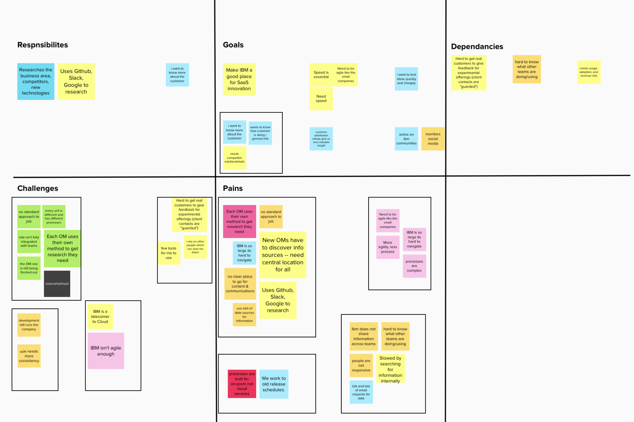
Empathy maps built from user interviews.
It was clear that a central, unified tool was needed to empower offering managers and give them the ability to quickly and efficiently focus on their offerings without spending hours each day toiling with different outdated platforms.
I synthesized the research feedback into a number of key requirements that would make the dashboard successful.
The dashboard needed to...
1. Allow offering managers to quickly view the status of their offerings.
2. Provide in-depth information and historical data for key offerings metrics.
3. Allow managers and users to utilize one unified account over multiple offerings.
4. Provide offering managers the ability to search for individual users and SaaS offerings.
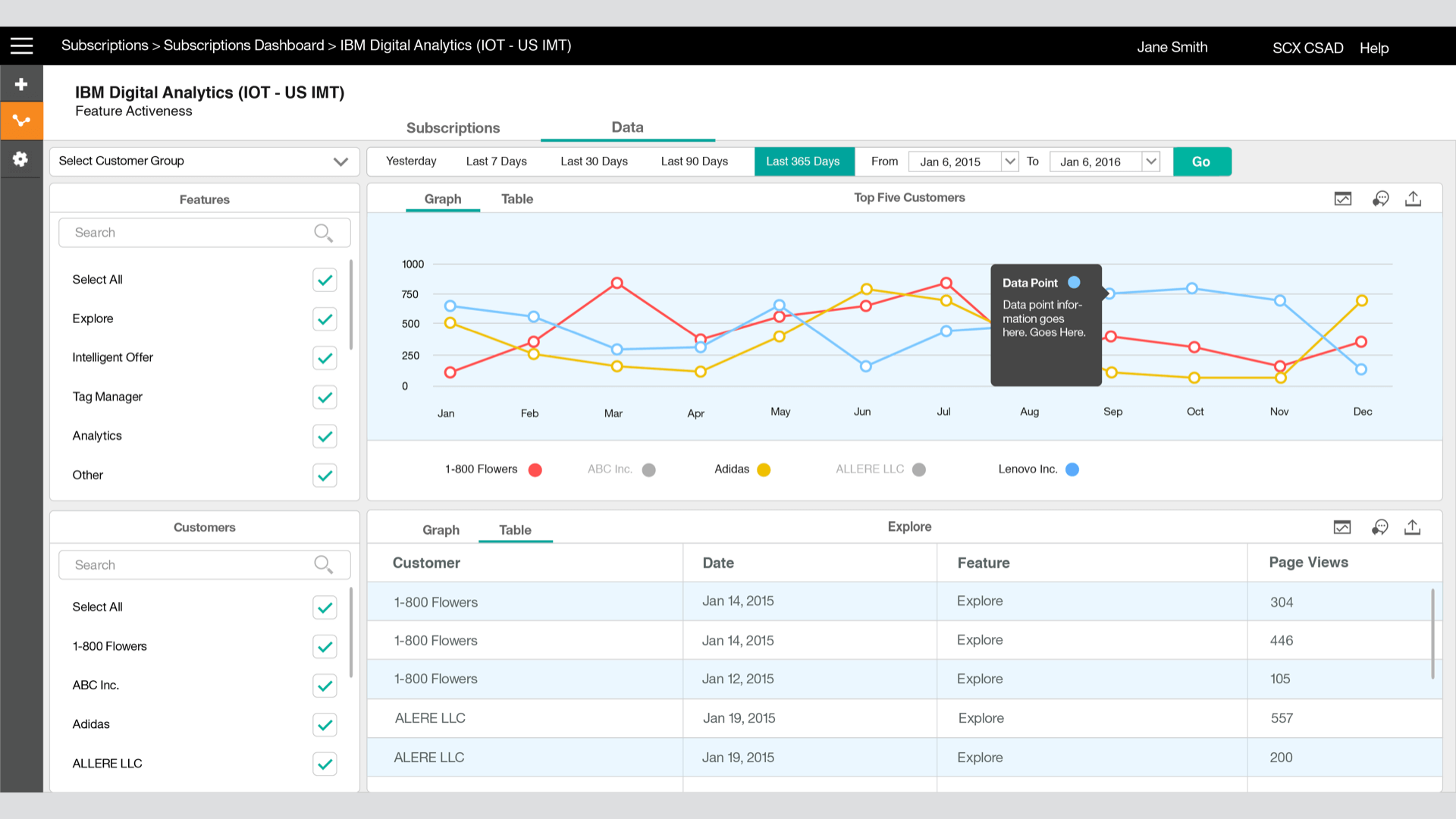
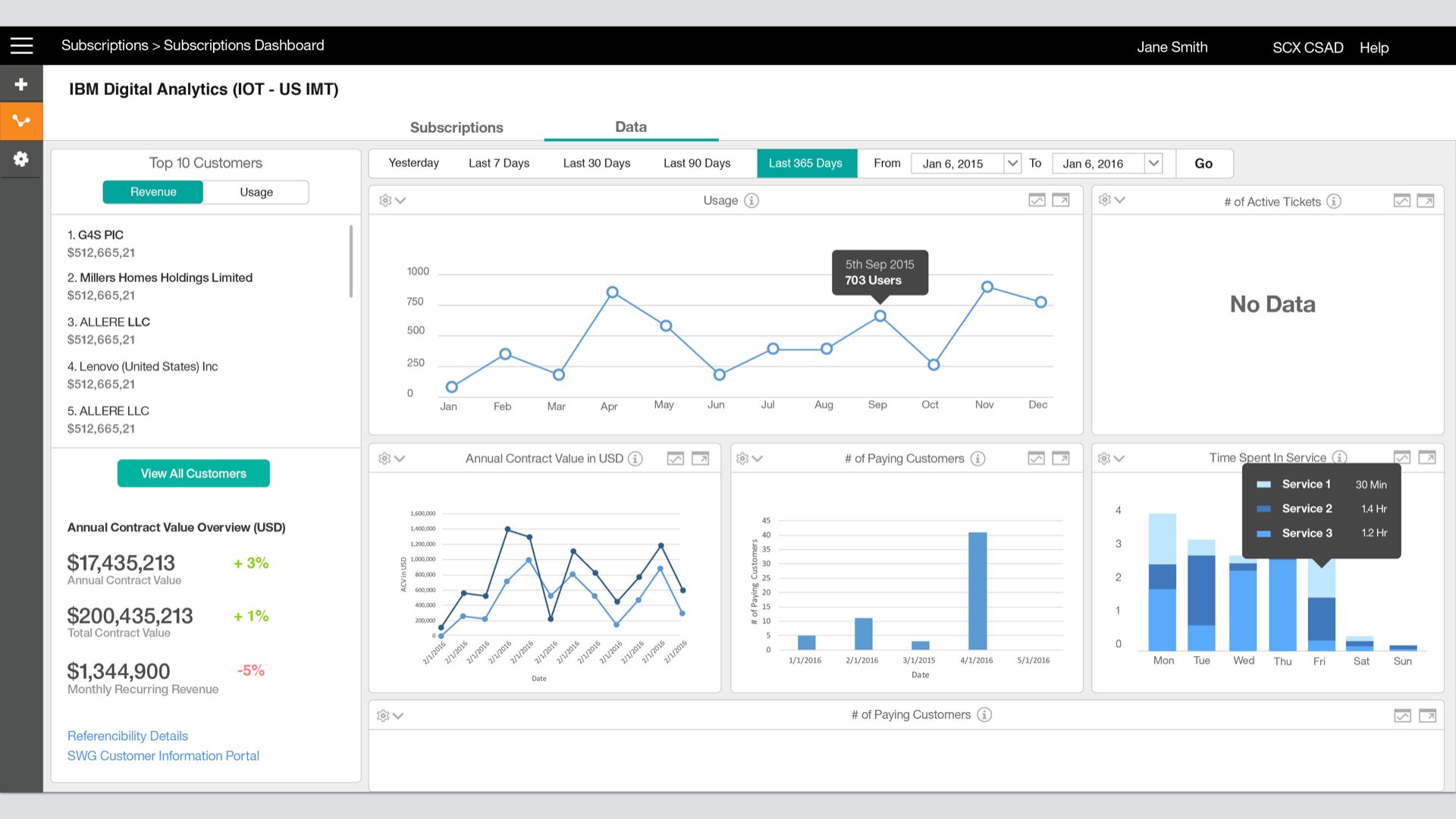
Using these requirements and research I started to sketch out and create some initial wireframes. The first problem I focused on working out was the 'Overall Health' system, which was an idea that grown from the user interview feedback. It was essentially an 'at a glance' style module that could give managers a quick overview of how an offering was performing. Using a number of key metrics such as usage and recurring revenue and active tickets, we could display the 'Overall Health' of an offering. This would allow managers to quicky gauge how different offerings were performing and let them prioritize where they should to focus their attention.
The other main challenge I encountered was designing the main dashboard. There was a database of complex offering information and analytics available to display but it needed a home within the new tool. I sketched out some concepts and settled on a card style layout, where an overview of each data point could be displayed neatly, side-by-side. One of the main reasons I went forward with the card layout was so the user could personalize their dashboard and customize it for their needs. User could then select a card to view in-depth information about that data point.
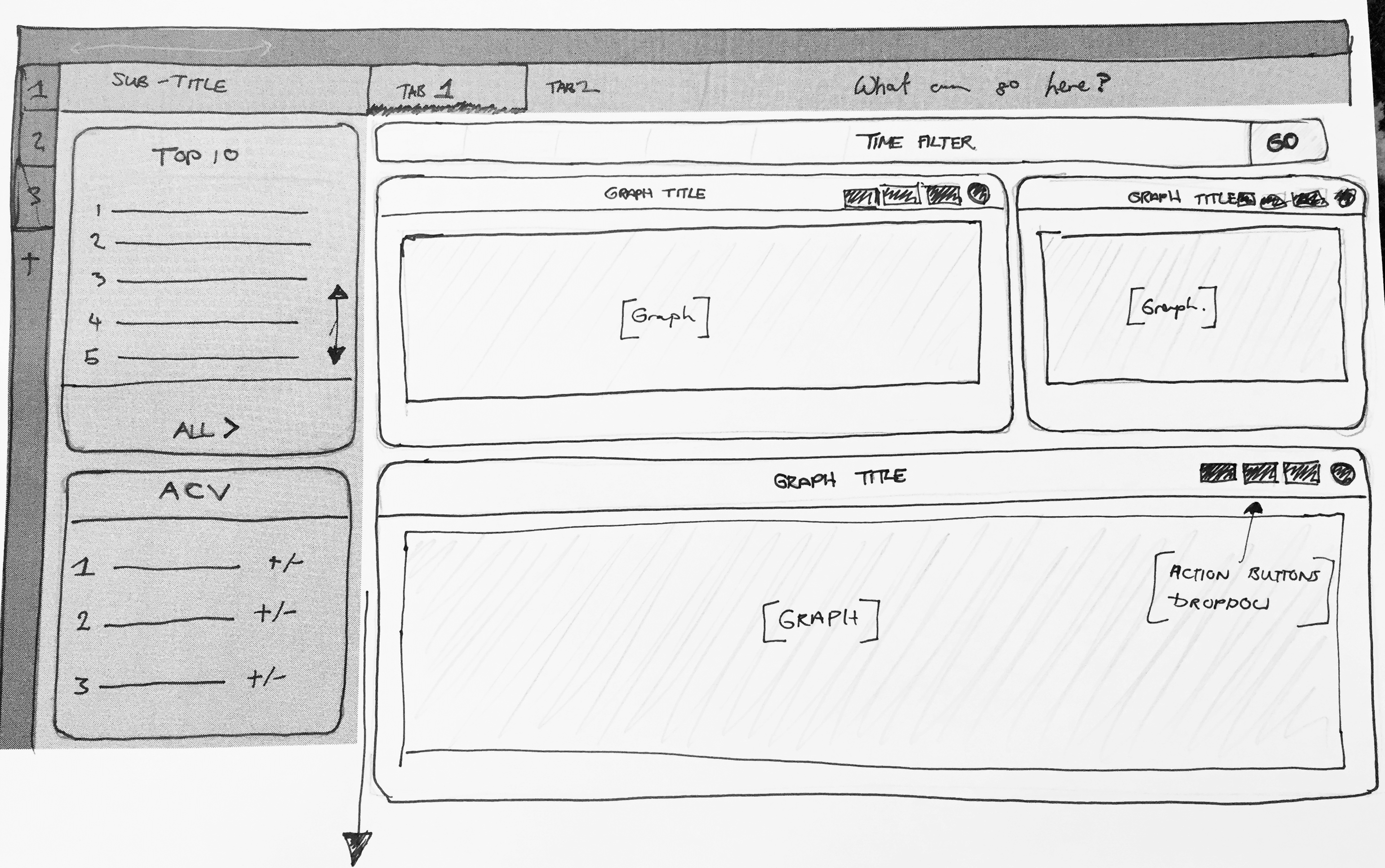

Early sketches for the success 360 dashboard.
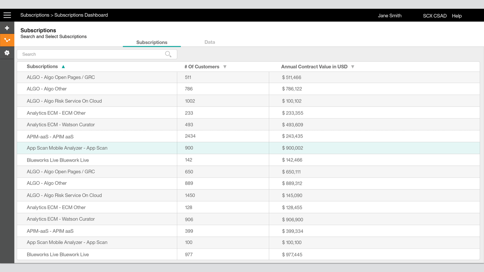
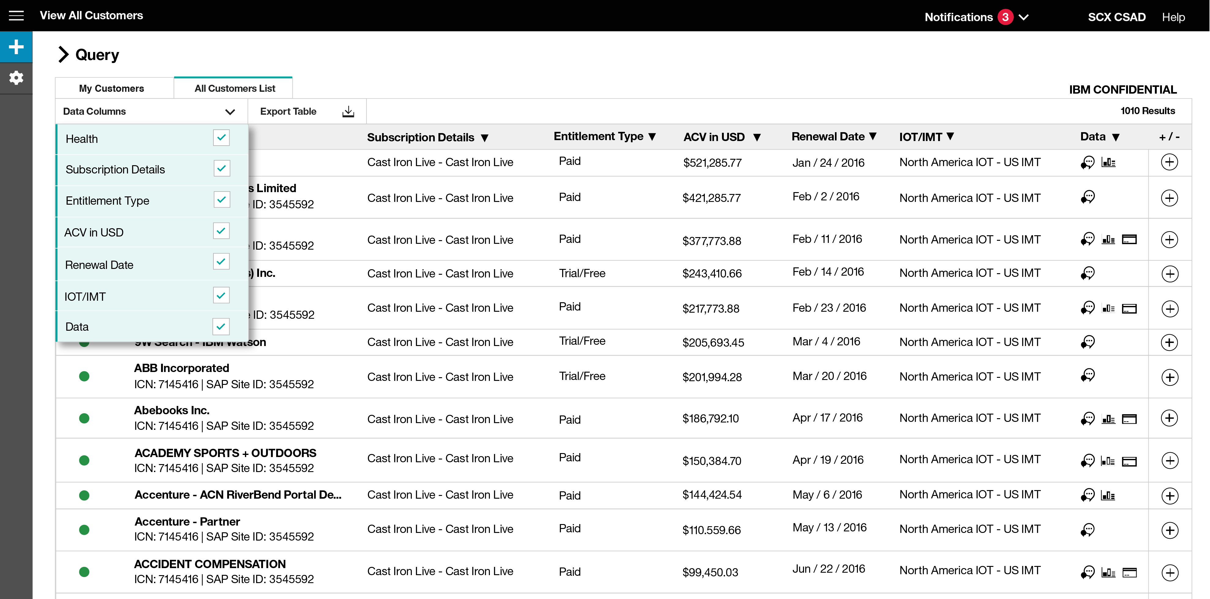
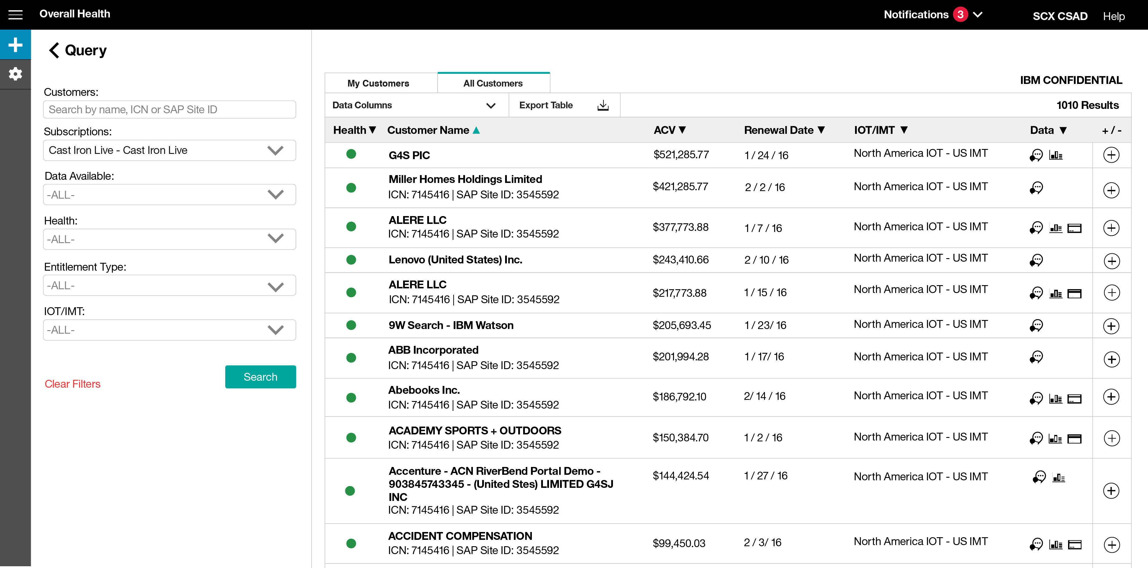
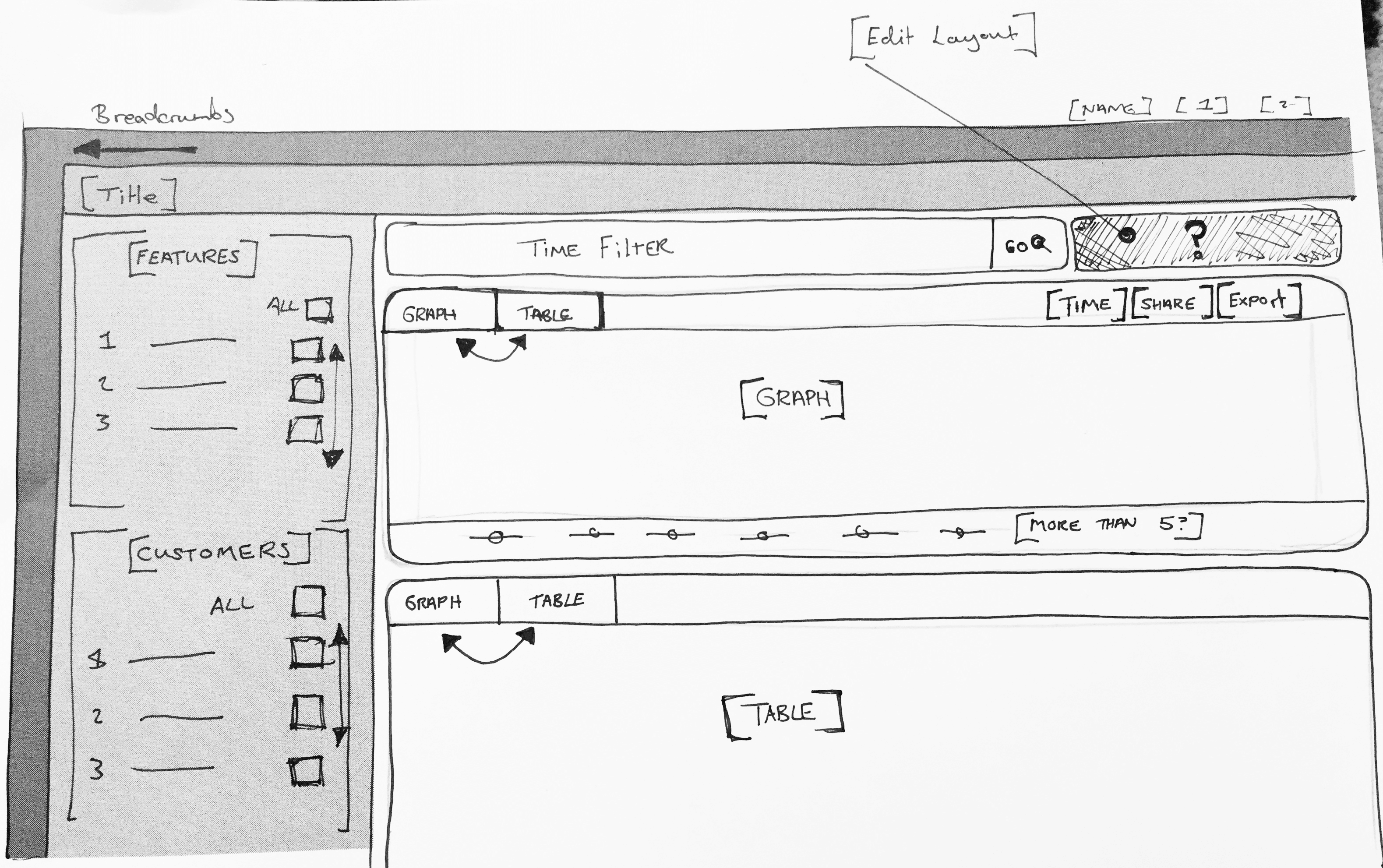
Finally, I worked to develop a comprehensive search system, where users could search and filter through thousands of offerings to find detailed information about them. The primary challenege designing these pages was fitting all the relevant offering information into the offering table. I Iterated through a number of layouts and had to incorporate Icons to convey more complex information.
The initial set of wireframes were refined through testing sessions with offering managers using a simple invision click-through prototype. I gave users a set of tasks such as searching for an offering and viewing particular sets of data. Afterwards, I asked the users a set of questions about their experience. The initial feedback was extremely positive and helped validate the ‘Overall Health' but it did lead me to further refine how the search table was laid out.
After testing and refining the wireframes I met with the internal development team to begin implementing the designs.
My time on this project came to an end after I had delivered the key features and they had been put into development. I moved to another design team and did not get continue working on this project. As I was the sole designer on this project, I felt accomplished and fairly happy with my final designs as I had recieved such positive feedback from the users I was designing for. It was challenging working on the visual design as it was something I didn’t always do on previous projects, but I felt like I delivered a good final product and it was a big learning experience for me.
The feedback I received from different offering managers was amazing and incredibly positive, as they had been dealing with these huge pain points for a number of years. It was incredibly rewarding to help create a tool that would have an immediate positive impact.
Below are a selection of wireframes from the project.