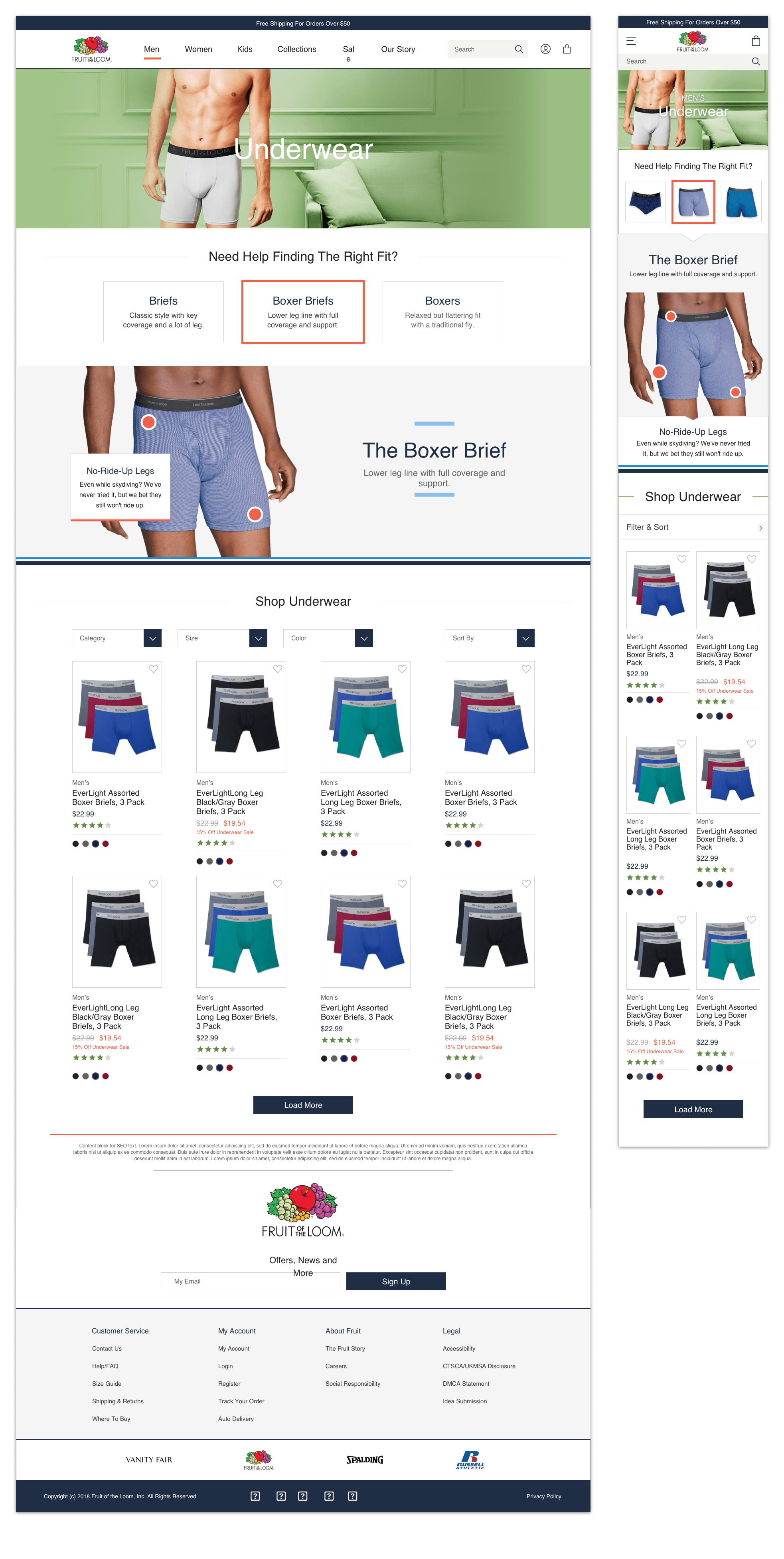

In 2018 I worked as part of a team to fully redesign the Fruit of the Loom eCommerce site. Our challenge was too modernize the site and create a fresh new digital shopping experience that would connect with younger customers and provide a platform for Fruit of the Loom to further grow their brand in the future.
At the beginning of this project, the team flew out too Bowling Green, KT to meet with Fruit’s leadership. We conducted a kickoff and requirements gathering workshop and as the primary UX designer on the project, I hosted a collaborative UX workshop with the Fruit team. In my UX workshop, I white boarded and sketched with the Fruit team to discuss their vision for the site, what kind of functionality they wanted and what kind of modules they believed would be beneficial. In turn, Fruit presented their extremely in-depth customer analytics and customer research they had conducted over the past few years.
This meeting was a huge success and we learned a lot about Fruit’s brand and core values as well as gain huge insights into the different customers personas they had created through their intensive customer research.
During the research phase of this project, the team spent a lot of time conducting competitive research on similar legacy brands such as Puma and Champion, to gain insights into how they were able to revive their brands and connect with a younger demographic.
The in-depth customer research and customer personas Fruit provided to us, helped us immensely in the research phase of the project. We were able to use Fruits research to begin crafting a number of our own personas. We created 4 personas in total, two of whom were aspirational personas.
We ideated and sketched out a number of ‘to-be’ user flows we felt would connect with these personas and fulfill their needs. We felt that to connect with younger customers, Fruit would have to embrace more user generated content and be more transparent with their values, sustainable practices and heritage.
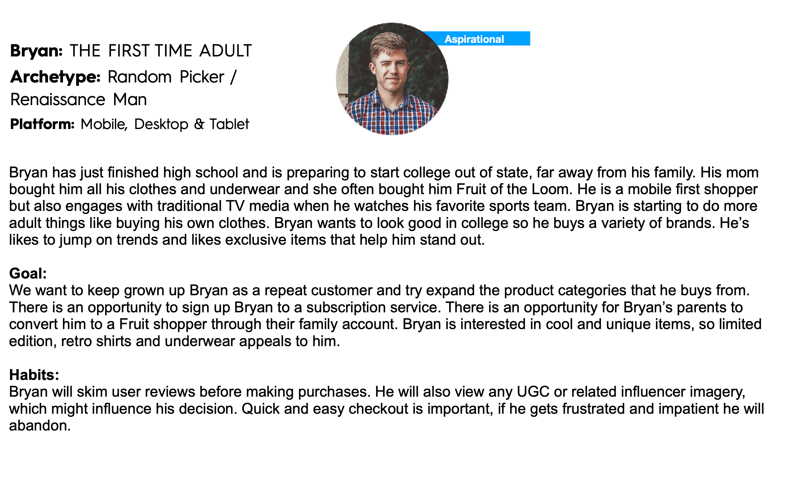
One of our aspirational customer personas.
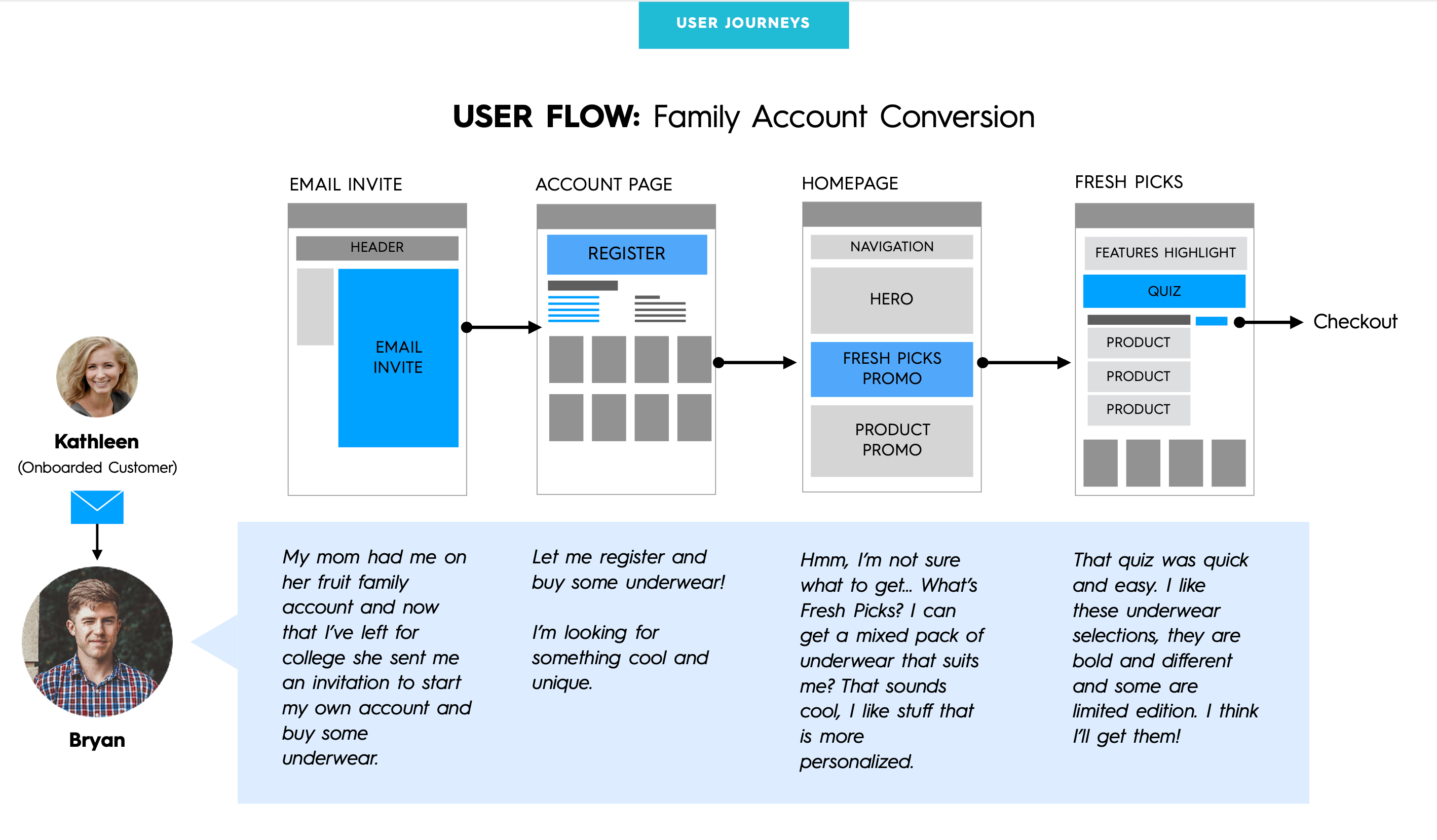
An aspirational 'to be' customer journey.
Our first challenge during the sketching phase was to map the existing site taxonomy and refine it. Fruit had a lot of redundant and unfocused categories that we wanted to remove, merge or improve. I went through each category and subcategory and documented each product and created a new category hierarchy. One of our decisions was to merge the ‘Boys’ and ‘Girls’ categories into one category due to the limited number of products in each category.
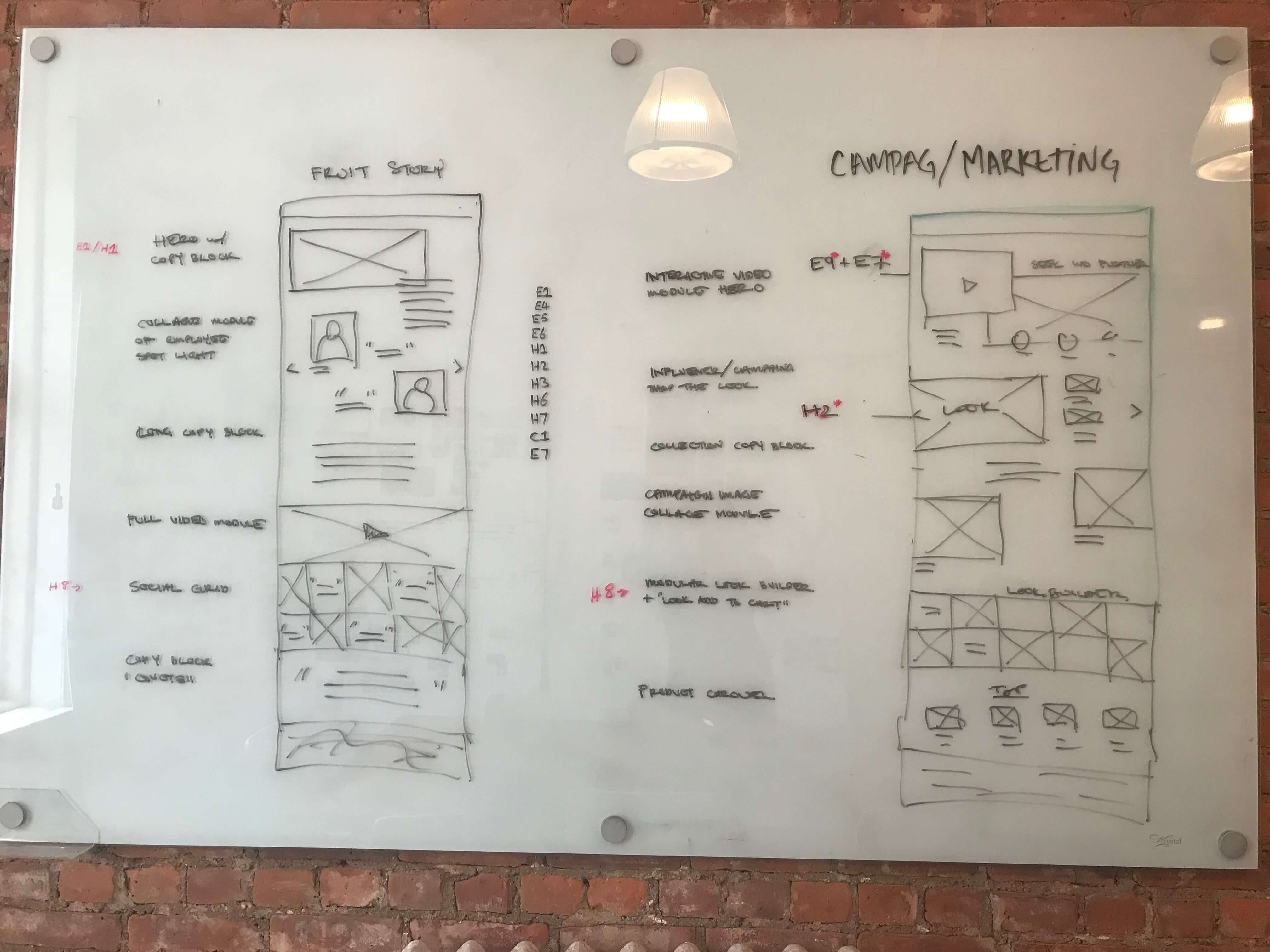
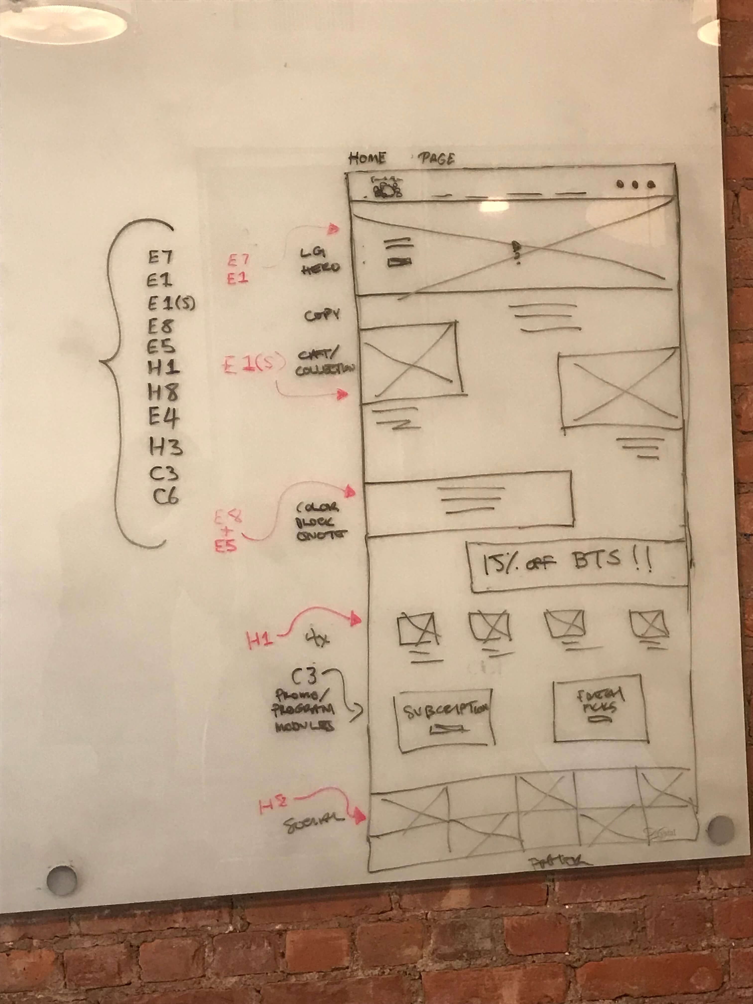
Wireframe sketches from our early ideation and sketching sessions.
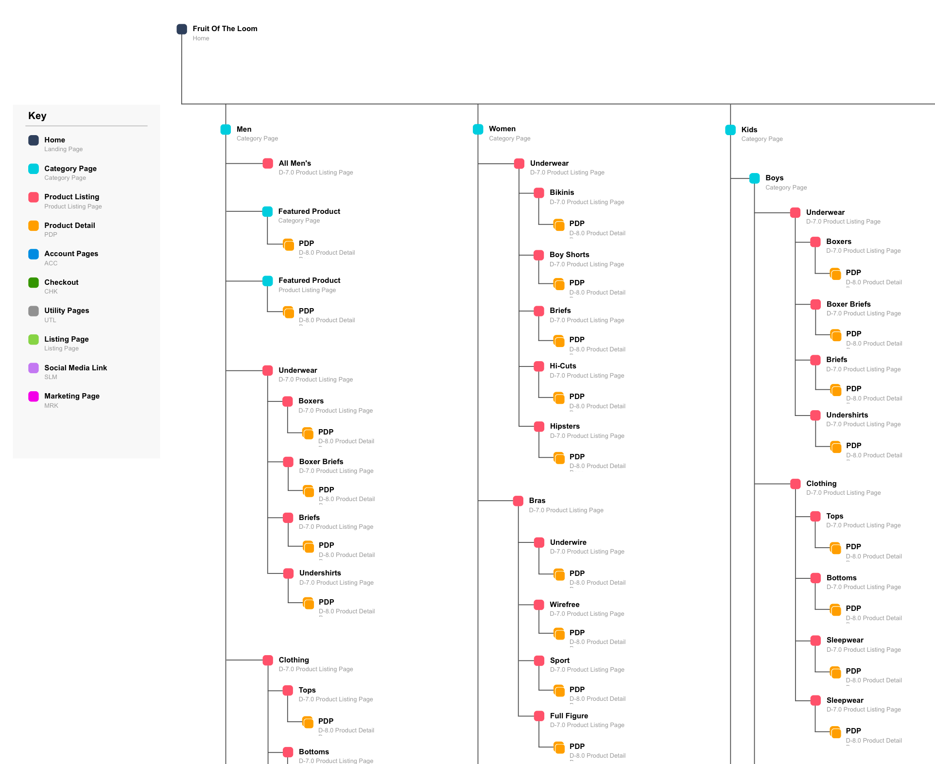
A close-up section of our improved site taxonomy.
After mapping out the new site taxonomy we began the wireframing process. We divided the project requirements and pages out into 5 sprints. Each sprint would be about 2 weeks long and after presenting the wireframes to the client, the work would be sent to the visual designer.
In sprint 1, I wireframed out the navigation dropdown menus and global elements such as header, footer and search.
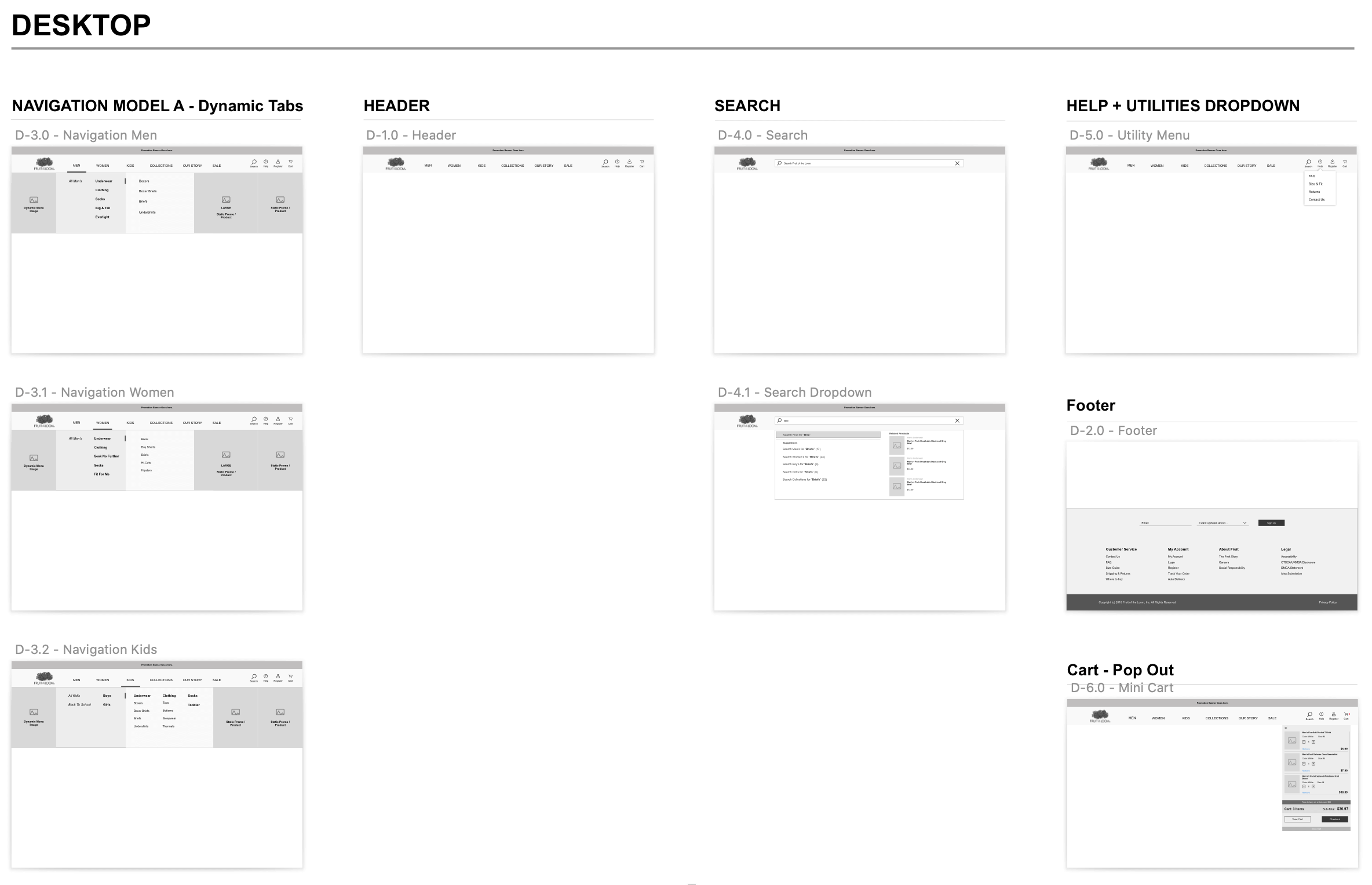
Selection of navigation wireframes from sprint 1.
In sprint 2, I focused on wire framing the product listing page and product page. In the product listing page I improved the product filtering system so users could dynamically and more easily find relevant products. I improved upon the previous product page by including a comprehensive buy-stack with the added ability to subscribe to certain products such as socks or underwear. I added a number of content modules beneath the buy-stack such as a technology call-out module that highlighted the different features within the product and a ‘shop the look’ module that allowed users to dynamically explore related products.
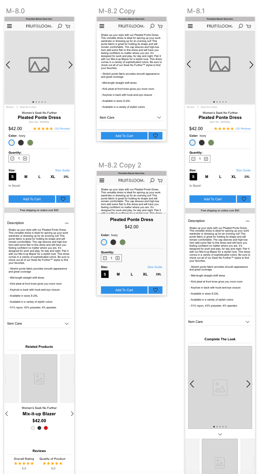
A portion of the mobile PDP wireframes.
In sprint 3 we focused on category landing pages and marketing pages. These would be essential for releasing new products, showcasing campaigns or telling brands stories. I knew these pages had to be modular and multi purpose so I designed a number of simple multi-purpose modules such as large header videos and image spreads as well as more dynamic modules such as ‘stylist picks’. Fruit could build a marketing page using this toolbox of different modules to suit a variety of needs.
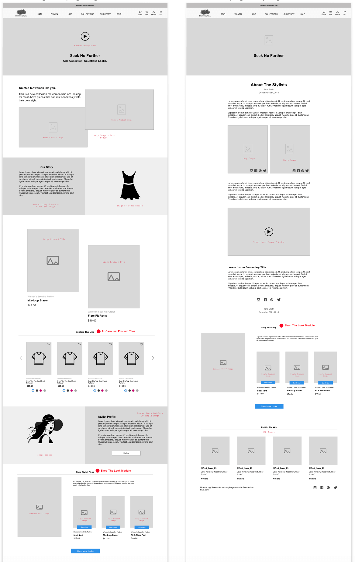
Some wireframes of the marketing pages from sprint 3.
For sprint 4, I focused on the homepage and a comprehensive size guide module. Since Fruit’s main product was comfy underwear we knew we needed to create a strong sizing guide that would provide customers with more knowledge and more confidence when deciding to purchase a pair online. We researched best in class sizing guides and worked with Fruit experts to make a dynamic, easy to use and clear to understand guide for finding the perfect fit.
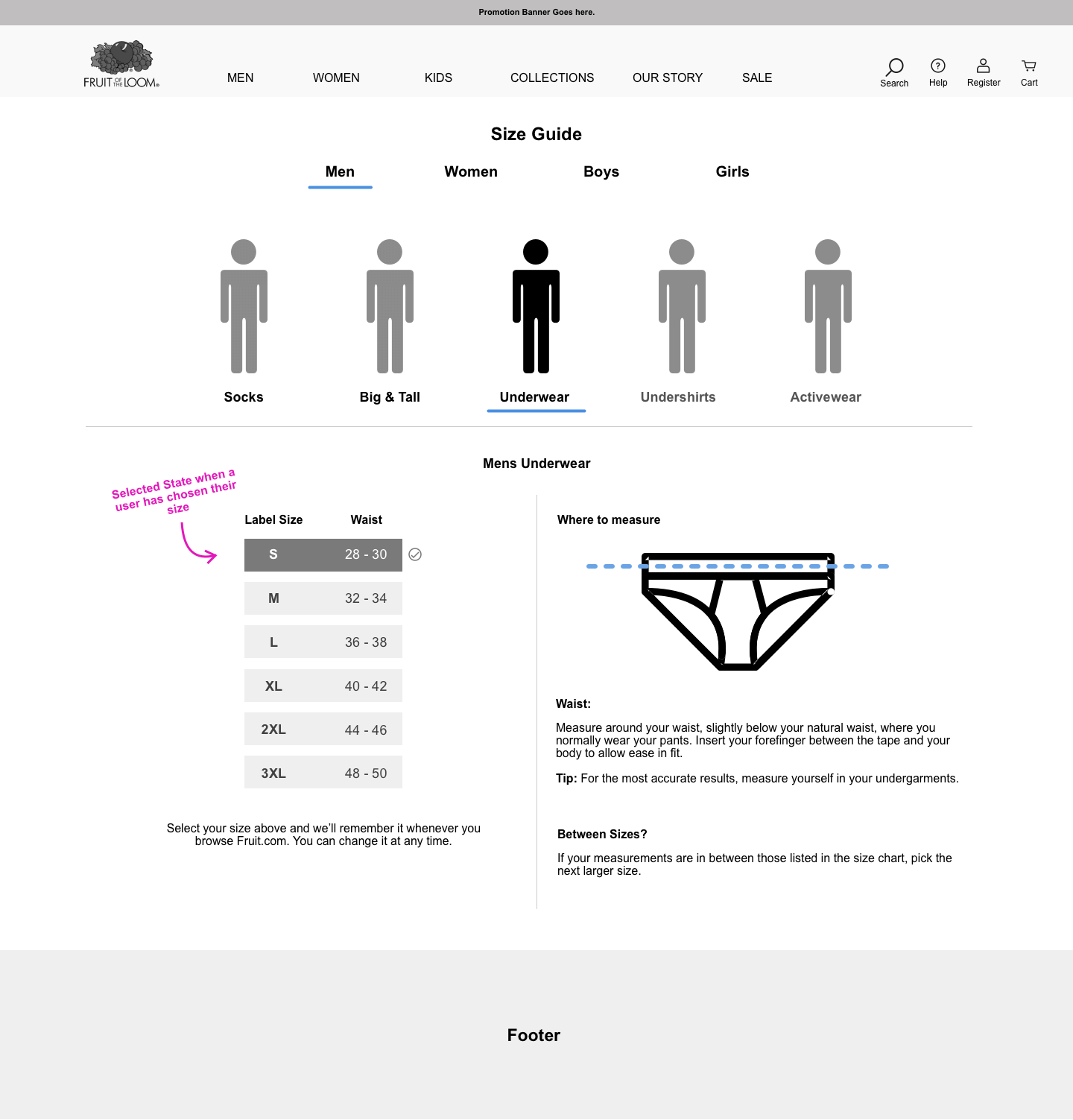
Closeup of the dynamic sizing module rom sprint 4.
In sprint 5, I designed the cart and checkout pages. This was an intensive sprint as the checkout flow contains many important elements and is very state heavy. The main challenge during this sprint was the subscription checkout process, as users could buy and manage a subscription box of clothes. I had to design out a way for users to add a subscription to their cart and then manage their subscriptions settings in their account page.
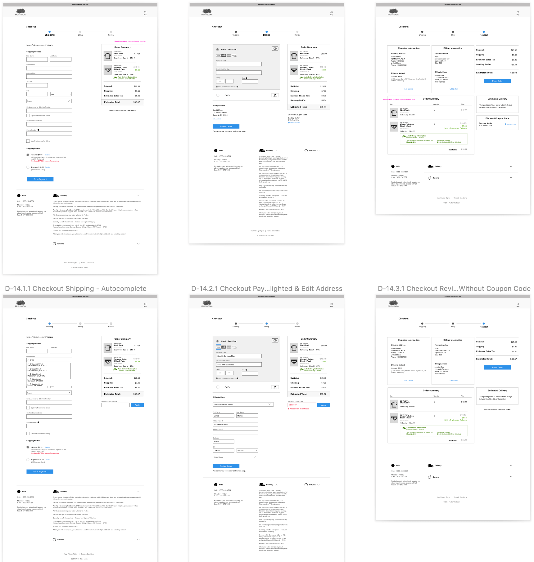
Selection of checkout wireframes from sprint 5.
After completing each sprint, conducting reviews with the Fruit team and refining the designs, I sent the completed wires to the visual designer. I worked with the visual designer to provide additional UX support as they brought the pages to life and created a whole new visual experience for the site.
Once the final visual designs were complete, I wrote technical annotations for each module and page element.
The new Fruit Of The Loom eCommerce site can be seen here.
This project was one of my first complete eCommerce projects and at times it was challenging, however I am extremely happy and proud of the final result. I learned so much working on this project and I felt the team delivered a beautiful and innovative site for Fruit that will provide a strong platform for them to continue to grow as a business.


